I have known and worked with Becky Guenther for years, maybe 10. We have done all 11 spaces in her home top to bottom, as well as the front porch . . . It's funny though, after such a long time, styles change, new things come out and we all need to freshen up! We tweaked her kitchen not to long ago and this week we did a re-design of her family room, the time had come. While I may not be "known for" subtle, somewhat traditional designs, it's not to be said I can't and don't enjoy working in that style.
Both Becky and Jed were quite traditional in their tastes when we first met, but over the years I have pushed them a bit and with this room re-do I am seeing a slight transitional look come through. We have lost the reds and tans and moved towards the taupes with an introduction of a teal blue. Take a look at our latest install !
The tie back to my favorite detail in the kitchen, now looks even better.
I created these pantry doors using upholstered insets with nail heads and two vintage pulls I was holding on to for just the right job.
Another detail I love in the kitchen is the addition of these oyster shell pendants.
And a new banquet around a 50" round table.
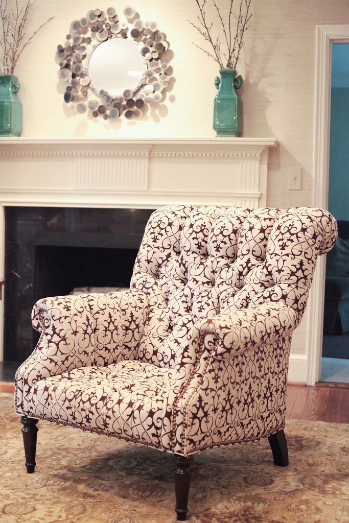
The "formal" living room is filled with unique pieces against a textured grass cloth.
I love the small bench we added for this dead wall space.
And this gorgeous mirror screen fills another dead corner next to the fireplace.
The feather pillow was a hard sell at first, not it's a fan favorite !
The dining room was one of the first rooms I did. Working around the existing chandelier and sideboard, we added a blue glazed ceiling, rug, and new upholstered chairs and accessories.
all photos by mekenzie france
Well Becky, love your new den! Looking forward to that master bedroom re-do!


