Hi . . .
It's Sunday, kids and hubby (and most importantly, my Izzy, just kidding) are home after a two week trip to "The Shore." So glad to have them home! It's raining, so we are just hanging . . cooking bacon (my, well not so secret now, vice). I came across this picture on Instagram just now by Matt French, a photographer I follow. I instantly thought of a project we are working on . . It has ALL the colors we are using, so pretty.
We have been working with two clients in Hickory, NC this summer. Friends, looking for a make overs. While I was in Charlotte, installing all my kids returning from camp, four in all, and meeting with my Fall clients, Maggie and Bree were making the trip to Hickory to oversee these installs. These two women, Ashley and Amber both like saturated color but needed help pulling it all together.
Ashley had a living room, daughters room and lounge, along with (the prettiest) back hallway ever to install and her friend Amber wanted a new look for her great room, breakfast room and dining room. It was a lot and its completed . . almost. With a few straggling pieces coming in this week, I cannot wait to take Mekenzie with us and shoot these amazing spaces. The girls were on it and I so appreciate all the trips up there !
Amber is a mother of triplets. Yes, you heard that right . . . three. She's also a trainer (Ashley's actually). I am amazed at the shape this woman is in ! But with her busy life, we needed to chose functional, easy, kid friendly pieces for sure . . . We started with this piece of art, hers, as our inspiration.
Take a look at her Great Room design boards. The space is a long room that shoots from the front door to the back, and wide open to the kitchen and breakfast room. The key pieces we incorporated were two, very tall, functional storage units that Chris made for us to flank the art. They are amazing.
If you follow me on instagram . . . here's a little preview of what Maggie has installed so far.
The back wall has two large windows and a fireplace. We had the old mantle taken out and ran grey washed tile from floor to ceiling. Two new, large navy sofas, two new gorgeous occasional chairs with custom fabric, and a special, custom bench with a lucite leg that Josh Utsey made for us.
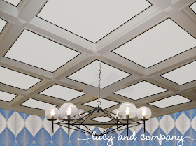
Her Dining Room received a face lift as well with new paper and lighting . . .
And the kitchen, a new table, chairs, banquet, paper and lighting, it's the banquet we are receiving this week - can't wait !
Now, with her art as our inspiration, we went in the direction of blues with the pop of orange. Maggie loves this dining room paper and up until now, we haven't had a taker, hum . . . we love it and are so glad Amber was on board. Great combinations.
So, why the post before the shoot? One, I love to catch up on blog reads on the weekend, and two, I am thinking through Amber's master bedroom, while waiting for my bacon. We installed this killer paper behind her existing bed and we need some good pillows and accessories. Good day to work up ideas. Amber wants a pop in there to tie to what we are installing in the great room near by.
I just remembered this fabric while playing around with things.
Kinda think it's perfect with the vibe in the nearby room. It has the turquoise of the paper, the pop of orange, and the grounding color of brown and grey, the two colors already in the master. Take a look at a few coordinating fabrics.
I say yes.
I think I like.
While working on these boards and looking for accessories and things, I came across this amazing artwork by Scott Albrecht. I love the colors, textures and shapes. This Jersey boy artist received a degree in Graphic Design from the Art Institute in Philly. Based in Brooklyn and member of the Gowanus Studio Space. His work incorporates woodworking, hand-drawn typography and geometric collage using vintage printed ephemera and found objects. LOVE ! Shop his pieces here.
Another amazing piece that would be so fab in, oh I don't know . . . somewhere . . .
So so gorgeous. By Natural Curiosities, this piece is entitled Morpho Emperor Peleides and is a large 81 inch x 58 inches. Butterfly patterns and wings. They wanted to create a huge imperial piece that showcases the regal quality of the butterfly wings themselves. Hand-selected and patterned in house allowing new designs and energy to emerge throughout the creation of the piece.
Ok, so we don't have a wall big enough, but it's beautiful huh !!!
Well, that's it. Amber if you are reading - let me know what you think of the master fabrics !
Happy Sunday


