Hi.
So it's Marsala 18-1438. Pantone's Color of the Year for 2015. At first I was not digging at all. I even laughed when I read Holly Phillips' (The English Room and fellow Charlotte designer) post declaring her official Color for 2015 to be Yves Klein Blue (here). She wasn't thrill with the Marsala either. It seemed flat, and frankly 1991 dated. I had visions of the "I want to paint my dining room a dark red, " ugh - which I was not a big fan of then... and now. It was a color I walked into on more than one occasion in numerous dining rooms. Paired with bright white trim, and bad "oriental" rugs.
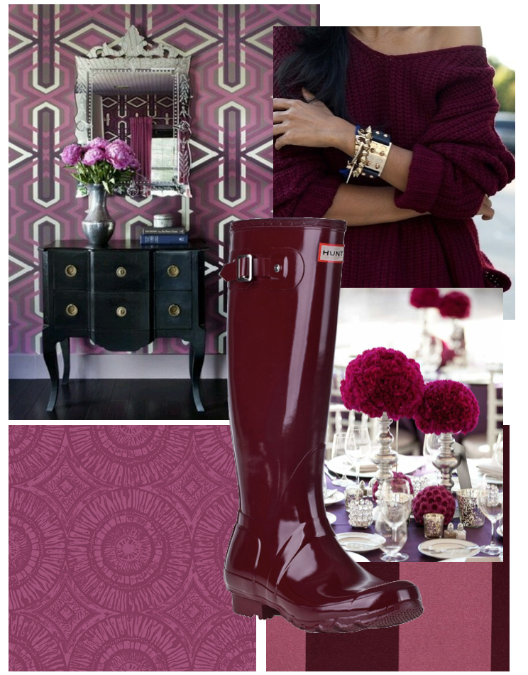
But, it has grown on me, only if it's a more vibrant version, with a dose of magenta mixed in. I do love a rich glass of red wine color, as the light hits it. I am also on a deep plum / purple kick. I think I am choosing to see the Marsala that way. Rich, shiny, with a hint of purple mixed in - much like these color inspirations.
These color version of "Marsala" I could go for.


