I was recently contacted by a new client living in San Diego wanting help pulling together her new home. When she told me she knew those amazing creative minds at Shine by SHO and had acquired several of their pieces for different spaces in the home I was ready to roll. Working around Susan Ortiz's collection of unique and California cool pieces would be easy and fun.
Where did I start? . . . right at the front door and worked my way through. I noticed splashes of blues in some of the artwork and a few pieces already in place, so I decided to head in the cool tone direction. I wanted to add texture and pattern and give each space an original look filled with layers. I have always believed adding layer upon layer warms things up and give a more interesting look but can often be the hardest part.
I took these rugs, fabrics, accessories and wall papers I started filtering in to create a finished first floor.
The entry foyer is tall, tall. Adding a "back drop" to this gorgeous console by Shine was the first thing I did. Rather than wall papering the entire space I am proposing to paper horizontal sections behind it and carrying it to the ceiling with small breaks between each section. The paper has a foil background with a slight reflective quality of blues, greys and teals. Two new, tall lamps and a very, very tall 70" mirror with an iron edge. The rug, a jute for high traffic, with a slight boho feel, and a fun sheepskin stoop along an empty wall by the stairs. All these "layers" will fill the space and set a tone.
I love this rug. With all the sleek modern pieces it has a bit of an aged look to it. Mixing the modern with the vintage give the space a bit of an eclectic vibe while being traffic friendly.
You immediately turn left into the dining room which is off to a great start with a large glass front built in, Shine table and chairs. I am proposing to paper the back of the built in with a deep teal shagreen paper to help the accessories pop. I would style it up a bit with the like of the Kelly Weastler dinner plates and a few art pieces.
I also might add two end chairs that differ from the side chairs. These wood back, slightly organic in feel head chairs would add just that layer I was mentioning and give it a more collected feel.
The walls are currently a pale grey, as is the rest of the downstairs, but to have this dining space stand alone and pop a bit I would paper the walls with this Phillip Jeffries grass cloth. It has a pattern, on pattern look though still soft and clean.
The curtains - I particularly look this hand-painted linen. Visible from the foyer it adds the right amount of color with the grounding touch of a sand color when mixed with this seagrass area rug anchors it all.
I also have a skinny console opposite the built in breakfront in a silver finish to compliment the existing chandelier. A little low lighting in the way of a lamp and art would add a warm glow to the space.
Heading straight back past the kitchen and into the family room, I want to continue our color palette.
With two existing sofas and a pretty, simple grey rug we need to filter in everything else to give the space a little personality !
Take a look at the all the elements I am pulling.
Gorgeous curtains panels for pop, simple ombre pillows and a new floor lamp between the two sofas - marble base with touch of antique brass. Currently the coffee table is an upholstered, tufted piece which I felt was a bit low and small, so moving it to the master bedroom and replacing with this larger, round antique brass drum.
A new, or pair of occasional chairs in blue with these unique side arms and a small concrete side table. All facing the TV and fireplace but also visible into the breakfast room where two Shine pieces - the table and console sit. I would add the same curtain panels to help combine these two spaces and create a larger great room feel. Relocating the blue foyer lamp to this spot and adding a large glass and antique brass chandelier. Mixing brass and chrome, absolutely.
A little bookcase styling and an additional upholstered bench by the fireplace.
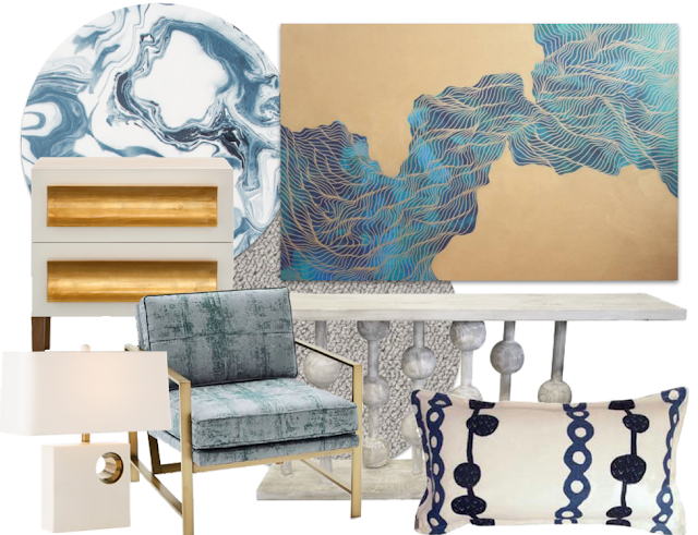
The last space that needed finishing, the master bedroom. Two gorgeous Shine side chests and an upholstered bed does not a bedroom make ! She needs stuff !!
Take a peek at all the elements I want to incorporate.
The bed needs a backdrop. I love this marble paper. I chose something with a lot of movement as my plan is not to add curtain panels in this space. With the wood shutters I didn't feel like curtains were necessary and would block too much light - but to give the space interest, objects and art can do the trick.
At the foot of the bed, two upholstered chairs and that ottoman from the family room. The room has the space, so bringing them forward a bit to face the TV wall would create a pretty visual when you walk in.
Hoping a console as oppose to dresser or "media" piece will fly. I love this long, grey washed piece under the TV.
Art can always make a space and this piece I love.
This piece by artist Tracie Cheng is so gorgeous with it's touches of brass and blues.
. . . and I might have to find a spot for a juju hat.


