Showing posts with label black and white design. Show all posts

5.19.2016

Install of the Day !

Hi !

It's back to business.  Just got back from our annual ICFF / Kips Bay trip.  Fun was had by all, especially the youngest of the group - Kate.  Loving this new tradition.  There's nothing I want more than my kids to be City savvy and noticed a growing fearlessness in this one.  Maybe she will go to school up there, finger's crossed.

What I really love is just walking the streets,  Kate amazes me at what she notices, shapes, colors, shadows.  Hard edges and angles.  She wants to live in a brownstone but it has to have a courtyard, "for a little a little bit of color and nature to break it up" she says.  Smart kid and I feel the same way. We just finished an install in Dilworth for one of my more edgy clients, LT Brady.  Recommended by our favorite lover of all white,  LT is a lover of all black.  After meeting and seeing her home I noticed she was also drawn to straight lines and angles with a color cohesive black (and white) style. When pulling options I stuck with just those two colors and gradated in between the two.


From the front door back the palette carries you from room to room.


We accessorized and shot these spaces just before we left town and with the "courtyard" in mind I brought over a few things to break up the rich, strong, edgy black palette and add a little depth.  Having recently re-designed my own home and office in all black and white, I was certainly in the black and white zone.  It can be so dramatic and strong and this client is just that. 

I particularly love this front office.  It's rich semigloss charcoal walls with new molding are brought to life with touches of lighter grey, warm earthy tones and a touch of navy - which I filtered in at the last minute and the verdict is still out on that !


I love the details in this space, the mismatched side tables, the layered rugs, the functional yet unique bookcases, the eye catching wall sconces and huge juju hat.  It's coziness draws you in right at the front door.  When designing this space I kept the dining room in mind - just across the foyer.  LT has the most gorgeous dining table with a live edge leg.  That one texture inspired the pieces I chose for this room. Embracing natural elements:  woodgrains, feather, leathers, horns !


Spinning around completely to the dining room the vibe continues.  We looked at several black and white wall papers and landed on this ombre.  It's pretty gorgeous and is really set off with the white woodwork.  Simple dining chairs with the all conversation inspiring dining table, by our fav - Josh Utsey.  LT found the sideboard and I topped it off by layering one of Keith's new pieces, a Slate find and the tall wood banana leaf to bring the wood up to eye level.  Always love a "collected" feel.


A last minute grey driftwood centerpiece filled with succulents completed the zinc top table.


The foyer also has a small powder room.   Enter one of my favorite papers, filling my foyer, it was a must have for LT.  Rather than your typical overhead light we pulled in a floor lamp !  This chrome piece stretches to the ceiling and creates a totally unusual look which we both love.


From foyer to main living and kitchen space the color choices continue for the utmost in a cohesive palette.


Touches of straw and wood (inspired by the dining room table) help warm up the hard lines a bit.  I love the fireplace color already chosen by LT, we just added a grey grass cloth to give it even more depth and texture.


While shooting the space, Brutus followed Mekenzie from room to room.  It was hilarious.  He was seriously positioning himself in each shot - #brutushambrady.  He matches so ok !


A few more warm details . . . 


and the always needed dose of nature.  


Working (and shooting) with LT - first of all - completely stress free.  This type A always has a spotless kitchen - woman after my own heart !


She, like me, loves a clean counter.


This new build has the best breakfast room just off he kitchen and opens to an awesome porch.  I loved the light fixture she had chosen, one of my favorite things.

We didn't need to really touch this space.  Had a few floater shelves made for her photos and art and that's it !


Love this sunny spot.


And that's a wrap.  Black and white at it's finest.


5.03.2015

Check Out Style Library !

Hi There

Did you miss my Style Library USA Instagram takeover (here) ? It was a fun weekend shooting images of things I was inspired by for my friends at Zoffany (one of my main go-to's for great textiles and wall coverings).  What is Style Library?  They are part of Walker Greenbank PLC, a luxury interior furnishings group of companies which design, manufacture, market and distribute wall coverings, furnishing fabrics and associated products for the consumer market.  The Walker Greenbank brands comprise of ZoffanySandersonMorris & Co.Harlequin and Scion. Targeted at the mid to upper end of the premium contract market, each brand benefits from worldwide distribution. The products can be viewed at flagship showrooms throughout the world, including the Design Centre Chelsea Harbour, London, and the D&D Building, New York.

I was also asked recently to be a guest blogger . . . I was happy to do it.  Thought I would give you a look at that post, but be sure to add their blog to your read list for inspiration and the newest intros to the world of fab fabrics and wall coverings !!!   I love them  !!!  (here)

We're delighted to have Beth Keim from North Carolina based interior designers Lucy and Company as a guest blogger. With a unique style and love for all things design, Beth has been working as an interior designer for 15 years. This long-held passion for creating special and stylish interiors has helped Lucy and Company become the flourishing business it is today. We hope you'll be inspired by seeing some of Beth's work and reading some of her top style secrets! (link here)


Art by Jessica Rowe 


Spring is really kicking in. All I want to do is coax my husband to get outside and turn our yard into a virtual botanical garden, in just one day. I want to fill all the flowerpots in the hopes they will bloom when I wake up the next morning.  I want to eat every meal on the back porch with my real china and linen napkins as if hosting a party daily.  Spring is pretty, light, fresh and warm. Spring is full of color and life.  

I am a designer who loves working with color, and multiple textures and patterns. I mix graphic angles with organic motions. I really have a love of large palms and banana leaves. In any room, any setting, bringing in that little bit of nature freshens up everything.

When working with tropical prints I tend to pull in crisp whites and a good dose of black to anchor those patterns. Every room should have some black; it adds a little “weight.” I am really crushing on black and white with a botanical touch these days.  After a recent visit to the Viceroy in Miami I was able to soak in all the details by one of my favorite designers, Ms. Kelly Wearstler. We designers find inspiration from other designers, artists, textile manufacturers both big and small as well as everyday images. I could, and have, spent hours just walking a city street, deeps in the woods, along a beach - finding shapes, lines, colors and then translating what I see into a design feel or look all my own.  My job then begins in translating what I see in my head in a visual way to my clients, via a good design board. These boards are crucial for those who just can’t see it. 

Recently I got a sneak peek at Amazilia, the new Fall collection from Harlequin due out this Summer in the US. When I saw the Paradise pattern with its artistic, loosely painted print, my heart skipped a beat. Mixing with black and white, this tropical print isn’t exclusive for your beach house . . . Take a look at how I was inspired!


I don’t shy away from multiple patterns and textures. Working on this master bedroom, I knew I wanted a big pop of pattern and color behind the bed as a focal point. I decided to fully upholster the one wall!  My upholsterer creates large, padded panels to fit perfectly on any wall or door.  Once I choose my key fabric, I play off that with multiple patterns to complement!


 Zoffany, Harlequin, Scion, Sanderson, Morris & Co., Walker Greenbank Contracts - my go to when starting a design project. Their Style Library puts all their offerings in one place. I search by color, pattern and use. The ease and accessibility makes it fast when pulling ideas. I then turn to my own showroom where all the books and samples are available to me. Take a look at a few of my favorite black and white walls papers ( H - M) and fabrics (N - S)


A. Harlequin’s Paradise 120353, B. Harlequin’s Hamadi 1655, C. Sanderso’s Ooti 231268, D. Harlequin’s Rumbia 131522, E. Harlequin’s Mirella 131066, F. Harlequin Cheree 131071, G. Harlequin’s Limosa 120339, H. Harlequin’s Oto 60777, I. Harlequin’s People 130731, J. Harlequin’s Spirit 60125, K. Harlequin’s Leaf 110373, L. Zoffany Persian Tulip ZTRA07004, M. Harlequin - Oria Kiely’s 110412, N. Harlequin’s Pure 2552,   O. Sanderson’s Tintagel 240108  P. Harlequin’s Orietta 8143,  Q. Sanderson’s Portobello 220047 R. Zoffany’s Verdi Damask 330953 S. Harlequin’s Silhouette 130329


/\/\/\/\/\/\/\/\/\/\/\/\/\/\/\/\/\/\/\/\/\

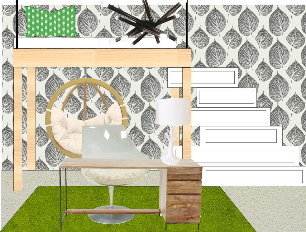
One more addition to my love of black and white, the oh-so versatile color combo, this teen room I have been working on.  Complete with a loft bed, stairs that also function as dresser drawers, a floating room desk and the ever so popular hanging chair !  Why did I choose this amazing black and white leaf paper. . . . let me count the ways . . .

>  black and white works with everything
> love the graphic pattern with the modern, clean lines of the furniture
> adds to the "being in the trees" feeling of a loft
> it's just plain cool !!!


Happy Weekend !