Howdy.. .
All this mountain talk got me thinking about Mountain Chic !
Ok, so I will never be this tall or look this good in my mountain gear . . I am talking about the look, the interior look, mountain chic. For me the look is rustic, a bit vintage, a bit modern, a bit quirky.
I am working on a new project for my clients Scott and Melanie Freeman (and their three girls), not actually in the mountains, but on a beautiful piece of property set back off the road, pond and all, here in Charlotte. We are working on their new family room. . .
Aiming to combine rustic with the clean, edgy look of modern. It can be done and here's how I plan on achieving this look, with the help of
The Salin's Group. Ben and his team are on board to transform the structural space, raise the roof, add the beams, floors and built ins. My job is to add the details to finish the space. Ben Collins is one of my favorite general contractors here in Charlotte. One of his projects, which I posted on May 20th "Great Style on Colville Road" was perfection. This time around, he is working with the look of the current home focusing on the family room addition (formerly the garage), an exterior living space, and a new garage apartment. Rustic Chic for sure.
Take a look at the design board . .
I started with the "rock bed" rug. A mix of different shades of grey - nubby and soft. Over top of a wide plank dark wood floor, the cool grey tones will pop and create a clean, sharp - yet "rustic" look. Layering in a dark, distressed leather sectional (with a more modern arm style) and iron and stone end table and "tree-stump" center coffee table. I love the whimsy of the leather bench with deep legs. And yes, planning to toss in a lucite bubble chair and "tree" wall paper in black and white for a little whimsy.
And this is a must !
Installing later this summer, to include an exterior lounge area, stay tuned for the finished product!
I checked out my inspiration files and came across this Elle Decor article I saved. .
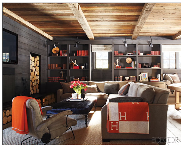
The Peak of Rustic Chic. The entire look I find warm, clean, sleek yet cozy. I found this, of course, after I starting working on my thoughts for the Freeman project, but seeing this space, it confirmed in my mind I was going in the right direction.
Take a look.
This is my favorite. The horizontal planking instantly changes the look from cottage to more modern. Don't be afraid of the dark tones either. With the right lighting and pop colors, there is nothing to fear. The set up is similar to what we are trying to achieve at the Freeman's. The TV wall in the design Ben is working on is actually hidden storage for an even cleaner, clutter free look.
Take a look at the ceiling in this exterior space. Love it.
I love that this article also showed these great bunk built ins. In the garage apartment, we are incorporation our own as well . . .
Great article !
Photography by Miguel Fiores-Vianna for Elle Decor
Another inspiration article I found is the work of Architect D. Stanley Dixon and Designer Nancy Warren in the North Carolina's Blue Ridge Mountains. Featured in
Atlanta Homes & Lifestyles
Located in Cashiers, it's a perfect example of a sophisticated mountain retreat. Again, I love the grey tones. These colors blend in so nicely with the scenery.
The horizontal planking . . . love it.
And check out the bit of check fabric in the pantry. Typical mountain . . perfect.
Photography by Emily J. Followill
Get your rustic chic on. .


