1.25.2014

Drawing on . . .

Hey There . . .

I love a good idea.. and this is one of them..  I came across it recently somewhere out there and tucked it in the back of my mind the next time I wanted to shoot my kids at home (we have a big chalkboard wall our kitchen).  It's a simple way to call attention to the subject and not lose them in a cluttered background !


and today was the day . . . Lucy's first Homecoming Dance - Gatsby Style . . . so my tip of the day, pay attention to your backdrop . .


photos by mekenzie france

Happy Saturday Night !


1.12.2014

How Jen Garrido and Windy O'Connor Inspired Me.

Hi There . . .

It was back to business last week at the office, but in the midst of boring year end paperwork came the go ahead on two new jobs to brighten my day.   I worked over the holidays designing two additional spaces for two of my favorite clients.  I say "worked" but during my down time designing these two spaces wasn't exactly "work," in that I was more than excited to play with ideas for these rooms.  I love both of their styles and what we created thus far turned out amazing. I have been working throughout their homes room by room, and now we are getting really creative with two fun areas, a landing lounge and a music room.  Two spaces that were not high priority in the beginning, but now that the major living spaces have been finished, it was time to put the icing on the cake and that is what these two rooms will be.

I wanted to write about two artists - Jen Garrido and Windy O'Connor.  Both of these artists were my inspiration for both of these installs!  Finding inspiration can come from anywhere, but in both cases a piece of art gave me direction.

Jen Garrido is a San Francisco based artist whose work my eye a while back and I have always kept her in my mind.  Take a look at a few of her pieces. . 


In her Artist Statement she says . . .


I construct my paintings and drawings by using a delicate balance of choice and process.
In response to personal narrative and internal dialogue, to the push and pull of the compositions internal gravity, and to the medium of the paint or drawing materials, I project images and forms onto the surface. As I compose, I weave shapes through the picture plane, the gestures I record can read alternatively as flat or as dimensional and sculptural. I favor nature-based forms and rhythms and I am drawn to shapes that tangle, overlap, sit, lean and lay. In my most recent work, the compositions balance between architectural and organic, painted and drawn, collapsing and firmly rooted and formal and biomorphic.
As I work through the multiple stages and processes of each piece, by weighing ambiguity with representation, by adding and subtracting, abstracting and transforming, I gradually arrive at the final composition.


Now these pieces of art have always stayed with me and when Molly Mudd, my fabric guru introduced me to Pedroso & Osorio, I thought to myself . . Jen Garrido- ish, in a fabric, perfect.   This one fabric inspired the room and tied back to the dining room we installed not to long ago.


We created a dining space of navy lacquer love and in the music room across the hall, I wanted to bring the feel of the dining room art in, but in a lighter version.


I created these boards to give her a visual.  I chose to bring the grey on the walls in this amazing printed, graphic grass cloth, by my favorite Phillip Jeffries.  The navy makes a return in the area rug by Stark.  The navy version of one of my favorites Antilocarpa.  This rug is so gorgeous !  The curtains, however, are the jewel in the room.  With it's large repeat, we are creating wide panels extending out from the windows and hung high.  


In this room, we are also incorporating a splash of coral in an occasional chair.  This coral is the accent color in the nearby family room.  The flow in this home is really coming together.  Not overly matched, but relate to each other.


We started ordering all the goods last week and installation cannot come quick enough ! I was thrilled she loved the look at first sight, not changing a single thing.  Full vision will come together !


Susan Brown and I met not too long ago at Hidell Brooks Gallery to look at art together.  With all the amazing pieces it was a hard choice, but one piece in particular we found perfect.  The size was right, and the colors were right.  Windy O'Connor shows her work with Rebecca and Katherine at Hidell Brooks and she had recently brought over several new ones.  After the purchase I got to work on the design.  She has a landing area at the top of her stairs, large enough for a sitting area.   Take a look at our purchase . . .


I love Windy's use of color and texture.  All of her pieces have such amazing depth.  Here are a few more . . .


Windy's Statement . . .

"Though I often work on large, non-representational abstracts, I always have a thought or feeling that I represent on the canvas. Many times it is a collection of visual memories or feelings. My goal is to convey a story through color, texture,  marks, and movement. I will abstract many objects in a piece and convey emotions through the energy produced by my thick layers of paint and knife work. I love creating compositions with color blocking, lines, combinations and rhythm of color. The act of painting is where I find the greatest joy!  Mostly, I am grateful to be able to practice the thing that I love until I am a very old lady."


This space is visible from the downstairs living area we finished last year.  I wanted to create something cozy yet a little more saturated in color.  The soothing strie paper I installed in the entire downstairs extends from the living room down stairs over the railing to the landing on one wall.  On this wall, I wanted a console, I knew that, but with our art purchase, I filtered in a juju hat pulling the teal from both downstairs and Windy's art to add a little balance, color wise.  I chose each piece carefully, each having a big artistic presence, each of a different material.  We have a horn lamp, copper sculpture hide storage ottoman and metal back chair.  The console is a combination of white lacquer, walnut stain and gray wash stain.  Isn't it killer !


But the big focal wall includes her new art purchase as well as dark, teal grass cloth for a real pop.  This paper is a F. Schumacher that Maggie found for me in just the perfect shade.  We are adding a new sofa in a grey velvet, layering a rug over the carpet, and an occasional chair.  The pair of thin black lamps create low lighting for warmth.  All these colors compliment what we have going on over the railing downstairs yet are much richer.  I can just see curling up an reading with a great view over the rail of the living space and back patio.


The view from over the railing.


Really excited to get these both installed, stay tuned . . .


1.05.2014

Install of the Day !

Hi There . . .

Installed Nichole Smith's Master Bedroom the other day as well.  Nichole is one who is not afraid of color, she has a whimsical spirit and while bright and fun is generally the direction she heads, I helped her create that feel without the overall space being too young.  I wanted to give her the bright, fun look yet with some sophisticated pieces of quality that would take this master bedroom to a place of luxury with a whimsical side, like her !

I started with this paper.  It was perfect for the look I imaged her going for.  Bright and fun, but not too young.  I love the feel of a hand drawn look, but I really love the slightly odd color combination.  Coral is a color I have been really drawn to lately.  This paper also has a touch of purple - so the purple sofa she already had in the room would tie together perfectly !


The other paper we used in the room pulled the color coral out and gave it more of a presence.  We covered the back of her two built in and black secretary and staggered the shelves, but notice this graphic pattern?  I asked Keith to paint it over the grass cloth for me.  While there are some amazing painted, graphic grass cloths I have used in the past, this particular job only needed a bit of it.  Keith wanted to use his new air gun . . . that was the real reason !
This one detail really made the room for me . . LOVE it.


I started with a board for her as well.  I suggested the paper as an accent wall behind the four-poster black bed she already had.  I chose two cream bedside tables, elegant with gold accents, large, with great storage, sophisticated. Two fun, Stray Dog lamps and mis-matched, yet cohesive pillows - all keeping in mind the purple sofa she already had in the space.  This paper really did the trick on pulling the colors together, and adding a slight, colorful, bright feeling.


Thanks Nicole . . . what's next? !


Install of the Day !

Hi !

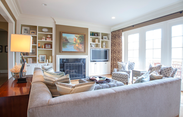
Ran by Kassie Hunsgate's the other day with Mekenzie to shoot her family room.  We installed it just before Christmas but recently stopped by take a few pictures.  Having Mekenzie working with me has not only spoiled me but help built such a good looking portfolio.  Good photography is everything and while I would love to do more of it,  I will be the first one to let the professionals do their thing.   This project also included my new design assistant Maggie.  With such confidence in her, it was so nice to just send her over for a little bookcase styling for me and not have to worry, I knew she would do fine and she did.  With all the multiple installs we did the week before Christmas, we were all scattered, Bree included, another one I have complete trust and confidence in.. so thankful for such a great team to help me pull off 7 installs in 10 days !!

So back to Kassie . . . she came to me in need of a sectional not too long ago and if you know me at all, I didn't really want to leave it at that.  Yes, a sectional was a great idea for that space, but I really wanted to help her tweak the rest of the space. That new sectional not only was custom to give her the perfect style and size for the space, it pulled the area together.  But I wanted a few more things to really tie it all together - accent pillows, maybe a console behind it, and her existing chairs a little recovering action.  She was game.

Kassie's colors are very tone-on-tone, neutral, shades of tan, brown, and cream.  I stayed with that but decided to layer in more patterns and textures.  Neutrals don't have to be boring.

I worked around shades of hazel, coffee, sepia, mahogany, umber, beige, buff, fawn, cafe au lait, chestnut and camel - had fun with the thesaurus .. sorry, but all sounding so much prettier than "brown."

Kept her existing wall color, window treatments and area rug, but filtered in shades of grey and a little warm gold paint color on the back of the bookcases. 


I worked on a quick design board for Kassie to give her a visual of what I was proposing . . it helped her see it.

With the new sectional, the room looks more encompassing and cozy.  The neutral color allows for layering of patterned pillows.  


I recovered her existing club chairs in a grey graphic and added yet another pattern for those pillows.


Her built-ins needed some styling.  I sent Maggie over to give it a stab.  She did a great job, wouldn't have changed a thing.  I knew I had a keeper when she #1 stayed on budget, #2 took it upon herself to hand paint a few of the accessories the night before, that is so something I would have done.. love that.


The key to styling shelves, in our opinion, larger items.  A few tips on styling these bookcases in this particular style room:

> Books in both horizontal and vertical positions
> Try turning them backwards for a cleaner look
> Larger frames
>  Keep the amount of pictures at half of what you want to do
> Mix in art
> Stagger the shelves
> Add a contrasting back paint color
> Similar vases, pots and boxes


Meet Maggie (with Izzy),  filled with enthusiasm, eager to help and has a great eye.


When doing a tone on tone room, remember that patterns are the key and layer then a lot !!


Happy to get all pieces in prior to Christmas for them to enjoy and loved this email I received on Christmas.  It made my day and loved she stopped for a minute during all the craziness to glance around and say thanks.  I appreciated that so much.


1.01.2014

The Allure of the Grand and the Perfect Venue

Happy New Year !

I was busy getting my hair, nails and toes done, picking up a new cocktail dress and 3" heels and climbing in a rented limo - destination Manhattan.  I checked into the Radisson for the night, along with 10 of my closest friends.  It was New Year's Eve (1987 that is).

Yep . . . that would be about right . . . when I lived in Connecticut.   I think I probably did that a time or two . . . But here in Charlotte, Keith, Kate, Lucy and I had a few steaks on the grill and some sparklers.   I made it to midnight, but barely.   It was a movie, big dog getting to know little dog (our 8 year old, 50 lb bulldog and new 8 lb dachshund puppy), laughing on the big green sofa and a little dancing.  An eventful night to be sure.  Being home with family was all the excitement I needed, but . . .venturing into the City back when was something I will always remember and I can officially say "been there - done that," when my 14 year old calls me boring.  

So, as I recall,  a big night out - dresser and coiffed - requires a venue of grandiose.  I have pulled a few images of my idea of the perfect New Years Eve venue - NYC style.  Big, shinny, opulent, over-the-top, sparkly and noisy.  This January 1st morning, loving the lack of hangover, I wonder just what went on last night at various hot spots - bet there are stories to be heard and I am sure I will hear a few.  I can live vicariously through you Mekenzie in your big high heals.

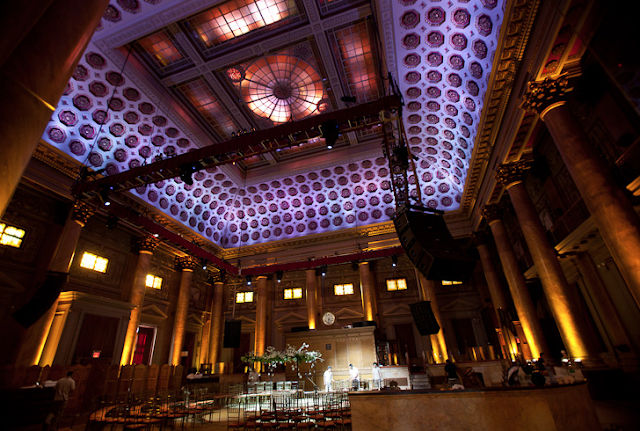
The C A P I T A L E  . . 130 Bowery, 65 foot ceilings and 40,000 square feet.  It can be booked for splashy weddings, private parties - big ones. It's the kind of place you just pause and say . . yowza when you walk in.  Built in 1893, it's grandeur is amazing !


The Gansevoort in the Meatpacking District . . a little more intimate, but still full of glitz.


How about The Waldorf Astoria . . .  glamorous for sure in a much more classic way.  Can you just hear the high heels clicking down that hallway !


The lobby of The Carlton, a favorite haunt of mine.  I hear the jazz in my head.


How about the sleek The London on 54th.  I loved the suites when I stayed there for Market.  Big rooms, gorgeous lobby, and the penthouse - I'll take that with an abundance of candles.


Or maybe a little bohemian vibe . . The Mondrain Soho.


Not your style - this space, elegant in a lighter, brighter way.  I can just picture the sun going down and the chandeliers glowing . . 


Tao, one of my favorite restaurants in the City.  Wondering why I have not run into DiCaprio running amok in there . . . I hear he frequents.


And lastly - loving this lobby at the Empire Hotel with it's floors, lighting and major drape drama.  Beautiful.


Loud or quite, glitzy or cozy . . . bring on 2014 and let it be as memorable as 2013!