Hey.
New house, young couple, worth the wait. I say that because they have just moved into their first home and are saying goodbye to apartment life. This home is really great. I love the layout, especially love the high ceilings and most importantly love that we are getting each other. Their style wants and mine are in sync which results in a smooth design plan, hopefully working relationship and install !
I came up with a plan for the entire first floor and upstairs master bedroom. Cohesive is the name of the game here. After spending the day really looking at all the ideas Heather had pinned for me in Pinterest, I felt I really had a good grasp of her style wants. The plan all started in the foyer and dining room. We are certainly setting a tone I feel and I cannot wait !
I am really excited to see these two spaces happen. Black and white graphic, but with the added element of brass and organic textures so it won't be too hard or too cold. I put a striking wall paper right in the entry, paired with a more organic rug and art. Bringing back the strong graphic look of the console table we are having made for the simple reason I could't find anything tall enough. A pet peeve of mine - 40" tall wainscoting and a short table.. it bugs me. Love these new console lamps in white and brass and their existing ceiling fixture works fine.
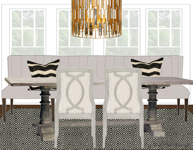
This dining room, just off the foyer will be show stopper I hope ! We are hand painting the floor in a high gloss black and white graphic. A nod to Mary McDonald's trademark look. We are adding charcoal drapes, a grey wash live edge table and hug 50" round shagreen mirror over the side buffet This room is rather large. I make it cozier and not just having a dining table and your typical sideboard, we are adding a love seat in the front window with to tall lamps flanking. I see a great flow from the front door, through the dining room and into the kitchen for a large party, with plenty of places to congregate.
Moving down the hall and into the family room and kitchen the color continue with a small added pop of color in the art and accessories. Two sofas as oppose to a sectional for a more open flow.
The family room opens to a large back porch, replacing the current doors with black french doors and possibly adding wood ceiling beams (if the quote comes in good!)
The family room opens into a huge and really pretty kitchen. The cabinets in there unfortunately are a dingy tan with green tint - we are changing all that to a soft white - just had to do it. New lighting, new bar stools.
The large kitchen dining area will soon have a custom 9 foot banquette, farm table and side chairs - a big want for this family.
With the entry, dining, kitchen and family room all having a cohesive sofa white, grey and black vibe, I continued it into her home office as far as furnishings and accessories, but the plan is to do a deep"Charleston green" which is almost black on the walls. Warming it up with a burled wood and soft old shag rug.
The fun doesn't stop on the first floor ! Moving to the master bedroom a big dose of wall paper, amazing new carpet from Stark and new pieces by two of my favorite vendors.
I can't wait to see this all come together before the holidays !
Stay tuned !!!


