A long time waiting ! A fan favorite client called last year to tell me they were moving down the street. It hadn't been long since we finished the renovation of their existing home but they found this new build on an amazing, long lot that checked off all the long term boxes. So it was game on. My job was to help fill in all the blanks on this build (design by Frank Smith): tile, plumbing, colors, cabinet styles - the works as well as incorporated the existing furniture we had just recently selected - in a different way for this home. Using in all different rooms for a new look and filtering in new pieces to finish off. I have been looking forward to shooting this home for a while ! Love this property, love this family.
Starting right at the front door I wanted to set a tone. Crisp, clean and interesting with elements that aren't so typical. The foyer boasts really tall ceilings and a view straight through the house to the gorgeous pool and yard in the back.
The entry foyer looking to the right and left to a more intimate living room and dining room, both casual yet cohesive.
All painted a clean Ben Moore Decorator White with shades of white, cream, browns and blacks.
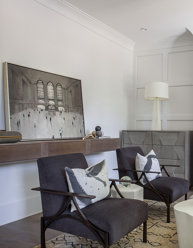
Using the former master bedroom pieces in the living room and adding cabinets and tables.
The show stopper for me.. This gorgeous art piece by Catherine Erb through Shain Gallery here in Charlotte.
Tall and simple side chests and new pillows.
A custom floating shelf with hidden drawers. Shain kindly loan me this amazing Geoffrey Johnson piece to give my client a vision for what could be ! The floating shelf was designed to anchor an art tv or staggered art instead of anything TV wise over the mantle.
The dining room - we wanted casual as well. Mixing the wood and upholstered chairs with a custom Josh Utsey table with lucite and brass legs. We repurposed the chandelier from the previous home's kitchen and filtered in the rest !
A few more floaters and lower cabinets Jacob Wolfe built for me as well.
To amp up the pattern, we used a contrasting end chair fabric that I love.
And more texture on the fireplace with this plaster mirror. Mixing whites and creams is something I like to do all the time.
Now, let's talk about this custom mural ! I wanted it hand painted and just over in the corner draping across the wall. I first worked with my good friend Nancy Hollinghurst on this look at my office. She flew down and hand painted it over the course of a few days. When it came time for the installation of this project it was at the height of the Covid shutdown and Nancy lives in NYC. Unable to travel, she graciously pass the project on the Nick Napoletano, a local artist and muralist here in Charlotte. Nick is amazing and captured both Nancy's and my vision for this custom hand painted piece ! (Stay tuned for more on Nick !)
It's an amazing look and another form of art when you want something different !
Also styled up the narrow side cabinets in a more artful. Using old book spines, and unique pieces from both out stash at Lucy and Company and BD Jeffries
Love the view all the way through !
Don't forget you dining table center piece. This one was design by Nectar here in Charlotte as well. We pulled a beautiful bowl and they created something where you can simple take out the plants to water. Fresh is best !!
It's a casual and collected place to all come together.
Heading down the hall to the great room and kitchen you pass the stairwell. I chose a large piece by Ron Royals to anchor the large wall !
And of course, a runner by my go-to .. Stark !
Another little moment at the base of the stairs...
Grouped a piece by Keith Keim as well as a very textured mirror and lamp !
The powder room is one of my favorites ! So many things to love.. from the sink, to the paper to the simple art piece (thanks BJ Jeffries !)
The great room and most used space. Large custom sofas in a soft charcoal fabric, mixed in the former master bedroom coffee table. We added an additional side chair to the one we ordered for the previous home. The fireplace turned out amazing. A wood finish to balance the wood kitchen cabinets opposite in this space, and a long wrap around wood mantle.
The kitchen just opposite mixes two counter tops both black leathered and white marble
A custom hood and floating shelves.
Take a look at the details !
Simple styling on the floaters using blacks for contrast and this fun custom piece by Kim Testone
through Hidell Brooks Gallery
We incorporated brass mesh on the side cabinets to break up the wood and keep the doors feeling a little lighter.
From the kitchen and heading around back to the dining room, another favorite spot, the wet bar. When tile shopping we came across this black tile with irregular gold veining. Done. Mixing in a custom hammered brass shelf by Tuan Le of 2dash1 finishes off the space !
Let's not forget the small back entrance on the first floor, simple and light with the beginning of a collection of Sam Sidney's felt art ! (available through Shain Gallery)
With RBG to follow !
Heading upstairs, a dramatic fixture paired with simple console, large scale vase and of course, Ron's beautiful large art piece !
At the top of the stairs we creatred a perfect little landing, reading spot !
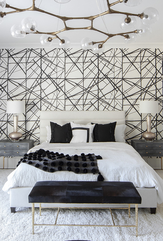
The master bedroom was another showstopper with the addition of Kelly Wearstler's wall paper as a backdrop.
I love this pattern !
photos by mekenzie loli (and my phone !)
Stay tuned... now that the weather has cleared up and the backyard is finished we are shooting the spectacular pool area !


