Hey There . . .
Such a fun home to reveal today for such an amazing new client. I met Traci Shanks though one of my oldest friends, Tanya Reid (owner of T. Reid here in Charlotte). Traci had been following my blog for a while and when she mentioned "this designer she found" to Tanya . . she said she should have know we were friends (Tanya and I are so much alike).
I spent 3 days installing this amazing space in July. I camped out in the house while my client treated herself to a hotel nearby to avoid all the painting "mess" and be able to come home to a big, clean, complete "reveal." Mission accomplished. Mekenzie shot this space for me just prior to Traci walking in the door, but decided to save this post until the missing pieces arrived - 2 dining chairs and the perfect art piece over the mantle. After Traci saw all that we had done, we decided to tackle the powder room and guest bedroom to finish off the first floor. Mekenzie and I went went back this past Friday and shot the guest room, powder room, and the dining space with those two anxiously awaited chairs. Seeing it all completed thrilled me to no end, as did the sweetest note from Traci . . .
"For over a year, I waffled back and forth on whether to sell my house and buy a new one, or whether injecting some style into it would fill my needs. During what we'll call the period of Great Indecision, I would gaze wistfully at the gorgeous homes here on Houzz, and one day I noticed that many of the rooms I'd pinned to my idea books were designed by Beth Keim at Lucy and Company. After months of cyberstalking her posts, I finally bit the bullet and called her for a consultation. We spoke on the phone and I emailed her photos of my home and a single photo of a gorgeous artglass bowl that I wanted to serve as inspiration for the design. When we met in person and I saw the boards she had designed from that one photo of a bowl, I knew without a doubt she was the designer for me. Just a few short months later we walked into our home to see the big reveal - four rooms of gorgeous, eclectic, vibrant pieces that tell the story of who we are as a family better than anything I could ever have dreamed of. Even my husband, not known for his ability to notice and appreciate anything in the house under normal circumstances, is completely flabbergasted by the dining room. I think he is still running his hands lovingly over the table. I could feed him sawdust in there and he wouldn't notice. I promise.
I can't imagine ever turning to another team other than Lucy and Company. Beth, her ladies, artist Keith (whose pieces totally ROCK), and the team of electricians, painters, paper hangers and carpenters who help Beth, have done such an outstanding job that there is simply no room in my mind for anyone else. We'll be back for more soon Beth - bravo!
I can't imagine ever turning to another team other than Lucy and Company. Beth, her ladies, artist Keith (whose pieces totally ROCK), and the team of electricians, painters, paper hangers and carpenters who help Beth, have done such an outstanding job that there is simply no room in my mind for anyone else. We'll be back for more soon Beth - bravo!
So the design inspiration for this project . . . a plate. One single plate started it all.
Take a wander through the newly complete first floor.
Pictures tell the full story. Our color palette - teal, navy, deep red and gray.
I first decided to take a basic "builder white" fireplace wall and create a focal point with color, paper and this amazing ring sculpture. Building from that we painted most of the downstairs a paler gray and then painted all the window casings in this space and the front of the house a dark red. That was a gutsy move and Traci was a little nervous, but let me do it, and I am so glad we did. Just a little something different and interesting. A new sectional, rug, coffee table, console and lighting rounded out this space. Keith created a large scale art piece for the big empty wall to balance the fireplace wall.
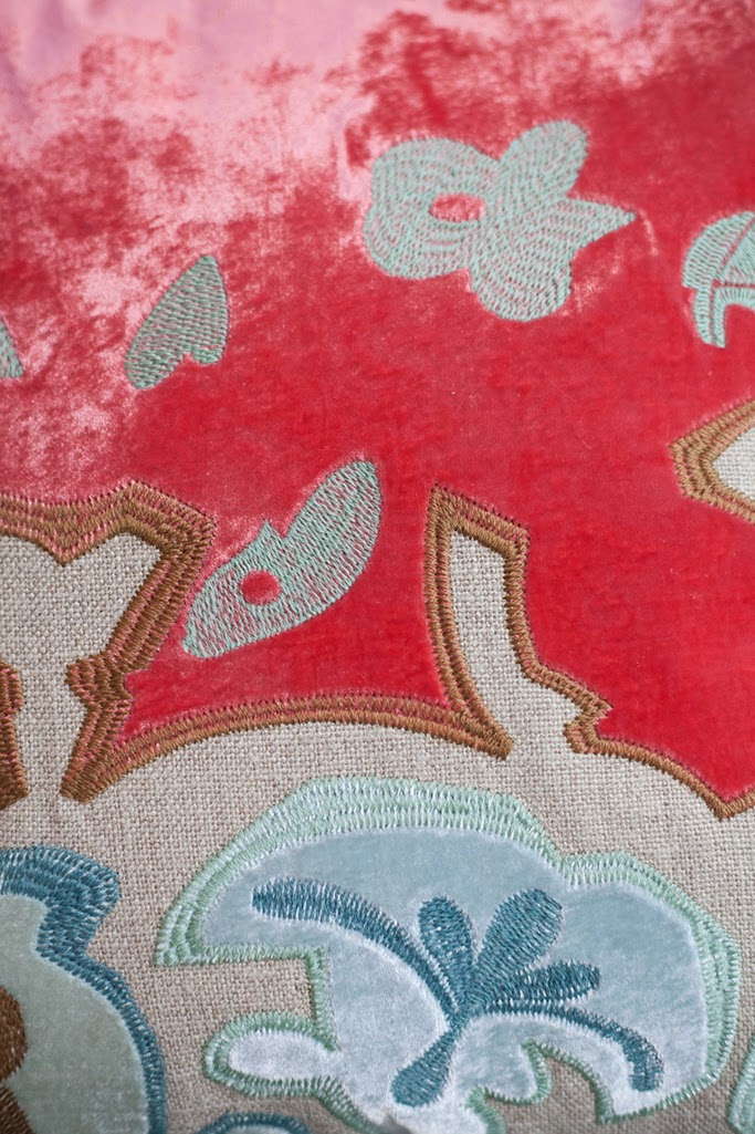
Our color combinations were all found in this one pillow and of course the inspiration bowl.
We added a low, yet very modern console table with two short ceramic lamps to divide the living from the kitchen space.
I love this room with all it's unique pieces and colors, very livable, very visible from the entry foyer and the kitchen. Clean, decluttered and streamlined with an artistic edge.
A custom sectional to fit the space perfectly. Custom is always the best, you get a bigger range of fabrics, styles and measurements.
Large Keith art with a touch of gold leaf.
Lighting was one of the things we really needed to do. I chose to work with the same vendor on all three big fixtures for cohesion. Soleria Lighting (available to the trade, so please call, I will be happy to help) have always been great to work with. They offered all sorts of sizes, finishes and often help me create just the perfect size. This piece, I have always loved, especially in a large vaulted room.
From the kitchen, where we added another new fixture, a zinc top round table, brown and white leather chairs and a transformed armoire turned wine storage, your view into the living space is dramatic. I love this flat, pressed felt rug, including all our color with a dose of green to break it all up a bit.
Take a close look at the zinc table.
Indoor / Outdoor these rugs hold up and don't bunch up under dining chairs.
Amazing find at Slate - this armoire - with new wine storage created for the inside !
The entry foyer has a new fixture as well. Also from Soleria it ties back to the great room, yet with a different look.
Traci's foyer art now looks even better in the space.
I had so much fun with the dining room. We added new wainscoting below the chair rail and painted it a bright white. This black, graphic wall paper is very dramatic and creates such a mood. The light fixture as well is gorgeous, also from Soleria, it's reflective qualities on the ceiling are gorgeous ! We also added sheers, just a single panel. These deep red velvet rings are so rich and beautiful.
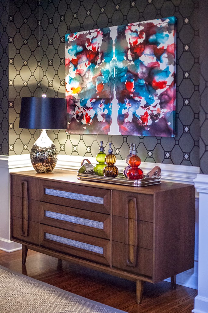
A new dining table. Live edge with chrome legs is paired with grey wash side chairs and new upholstered end chairs. All these pieces land on a Stark Seagrass in grey. Traci found a piece of mid-century to add to the nook, and we created another piece of art and highlighted it with a new lamp.
More art by local artist Rod Wimer pulls in more the home's colors. A friend of Mekenzie's, she was thrilled when she saw it come out of my car ! (His work is featured at Slate - go take a look !)
The stragglers, these head chairs, but worth the wait. Love the fabric on these beauties.
Keith's art and Traci's sideboard. Love.
Take a closer look at the window treatments.
art by Keith Keim
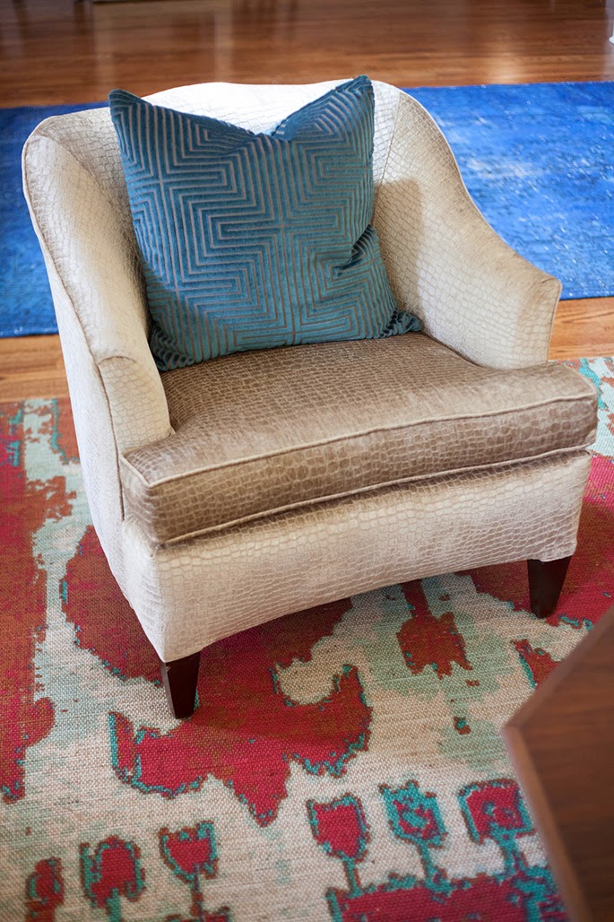
Midway through the design of the living, dining and kitchen, we decided to work on the front living room. It mainly needed painting. Changing the color from a chocolate brown, I also recovered her sofa in a rich teal velvet with navy contrast welt. I found two chairs at Slate and a rug at Market that I thought worked perfectly. I used Traci's bar, travel photos and accessories. So the front lounge got a face lift as well.
An entry over dye rug in navy was the finishing touch.
We were on such a roll, finishing off the powder room and guest room were two things I really wanted to do and Traci was game. This paper I fell in love with in New York. Martyn Lawrence Bullard used it in the Kips Bay Show House in the grey version, I chose the blue.
I wanted this very visible powder room to be something special. Right off the foyer it would get noticed. I chose to paper all the walls, paint all the trim a blue in keeping with the paper. We then created two mirrors to flank a single center wall sconce. These mirrors are upholstered in a vinyl (in case of water splashing !) I wanted a whole wall focal point (and not just your typical light-mirror-art over the potty look)
Just off the hall and powder room is a downstairs guest room. We decided to tweak it a bit. A new strong wall color, new headboard, side table, ottomans and lamp. Traci found another great mid-century piece for the space and I had to include a little art. This piece was a little something I found at Slate on install day. The green, I feel is similar in tone to the colors of the main living area and to break up all the color coordination it works (and I pulled this color from the new kitchen rug)
all photos by Mekenzie France
My boards came to life and I was thrilled. Such an agreeable, fun and enthusiastic client she is !
Traci made this entire project so much fun. Her trust level was really there, but I credit Tanya for that. I was so happy to give her an entirely new look, well overdue and well earned !
Happy Day.


