Morning !
There is nothing like a hard deadline to really pay attention to all the details. This deadline was the Wells Fargo Tournament at Quail Hollow. A long standing client of mine gave me a call right around the time I was having surgery and knew I would be laid up for several weeks. Normally I'd be like.. don't bother me, but in this case, I was thrilled I'd have something to do - not being able to walk and all for a few weeks. So I designed their new digs. The job, fill the first floor of a new purchase on the 15th hole and have it completely done by the tournament for .... this amount. Challenge accepted, game on. In my usual way, I stared at the front door and worked my way through. I know this client pretty well and know just how far I can push from their normally traditional boundaries. I started with art, a piece by Kristen Blakeney, which I knew was a favorite.


The blues, greys, whites and neutrals were my chosen palette. From the foyer you turned into the dining room. For this space I needed to work around a dining table and 8 chairs I had placed in their previous home back in 2012 . . . lasting power.

This space is long and has a bay window. What I meant earlier by "all the details" included this little area, not really part of the plan we agreed upon at first but I just went ahead and did anyway. I knew she would love and thank me later.
Two small chair & 1/2's, the perfect little coffee table and a hide to define the space. Done and it turned out to be one of my favorite little spots
New curtains with a hand stamped feel.
Turning into the kitchen which didn't need anything, great house !
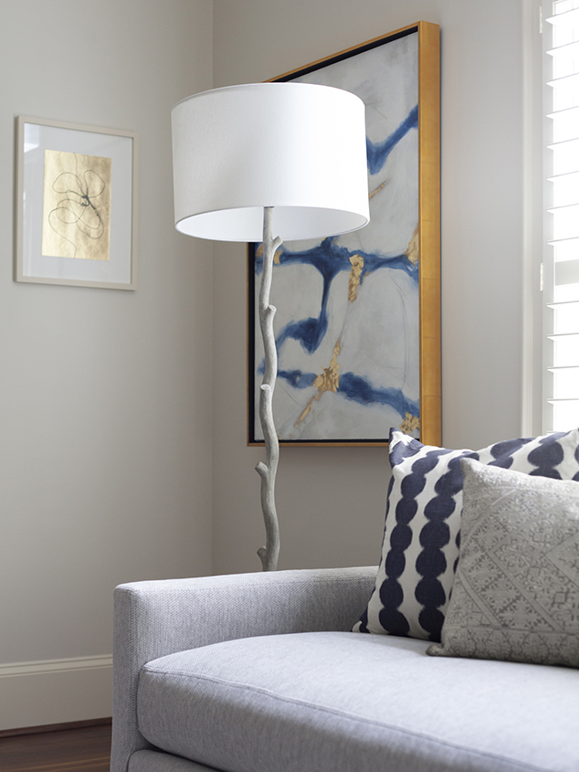
Love the feel of this living room. Clean, bright, open. We painted the entire space an off white to match the trim and took down all the curtains. I wanted a neutral palette with pops of blue. I wanted nothing to detract from the view out of the french doors onto the golf course.
A mix of styles and materials was important to me to keep you eyes moving around the room, but in like colors with touches of black to ground things.
I asked Keith to create two pieces to flank the large windows as I wasn't planning to do curtains. Asked for light and texture filled with a little blue. We incorporated a little of our coveted gold left we purchased in Venice this past summer.
art by keith keim
Huge bonus this space had such gorgeous ceilings !
My friends at Shain were so generous in bringing over not one but 3 art pieces I chose and thought the spaces really needed. I love to do this in the hopes my clients will see the art necessity and love as much as I do... and they did. Win win...
art by Cathryn Miles from Shain Gallery Charlotte
Had two beautiful custom swivels make in leather.
Love it all.
This is the view I was mentioning . . . pretty gorgeous, and while installing we had so much fun watching them set up for the tournament !
All neutrals, with a little pillow pop from Windy O'Connor. Don't want to detract from the course !
Circling back inside we placed 9 botanicals along the long hallway, they turned out so perfect.
Making a turn into the master I found another Kristen Blakeney piece with the perfect colors and size.
The master is so soft and inviting. Slight traditional feel with the window treatments but a more modern twist on the furniture lines. The lighter colors keep it much more modern.
Look closely the wall paper has a shadow graphic pattern.
It's pretty yummy in there !
Lastly one of the upstairs guest rooms. This one in particular I love with the pop of the wall paper, how fun is that.
photos by mekenzie loli
We pulled it off, just as my clients were landing in Charlotte and their friends were arriving, phew !
Thanks to all involved with was a big one . . .