It's been a busy couple of weeks and May is set to be one of the fullest of all, it always seems to be. I wanted to take a small break this Sunday morning and catch up on projects we've recently installed. This first, the Chapman's home in Raleigh, NC.
These relocated Californians did a great job renovating their brick Georgian with an open floor plan and room for all of their five kids ! The two front rooms needed the most attention though as they hadn't gotten to them quite yet. I love creating spaces that are casual, kid friendly, and relaxed. I wanted an easy flow from these spaces to the back of the home to create unity. Their colors in place - off whites, greys, neutrals and pops of blue, different shades of it. While keeping the navy accent wall in mind in the dining room across the foyer I actually started in this living room.
Take a look at my inspiration.
It all started for me with the wall paper. A subtle grey on grey graphic pattern with the look of something hand painted. I wanted to mix pieces and styles in this space, as I do in most, different chairs, different fixtures, a collected look.
Decided on a large black metal mirror to reflect light and two mismatched chairs. One tufted leather, one linen with a fabulous brass frame. This music room is a TV and technology free space to practice, reconnect, talk or find a quite place to maybe read that book !
Large custom art and custom chandelier to finish off !
Across the entry foyer from the new living space - the new dining room. We went back and forth on this room a bit. Dining to game room, but back to dining, which I was happy about. Though your "formal" dining room may not be used daily, it is typically located right off the front door and a beautiful introduction to your home and your style. My goal was to keep it somewhat casual so it might be used on a more regular basis. . . hopefully !
My client's had installed this wood accent wall and painted it navy. With that color being so prominent in the front of the house, I did take my color inspiration from it and worked off of that.
A new, large 72" round dining table and 8 chairs in a dining friendly leather. Modern horizontal top stitching. Lucite and chrome chandelier, new graphic drapes and a large art piece I commissioned Keith to do for us.
This faux ebony veneer sideboard also has a modern finish in a high gloss and the wood tones add warmth to the space.
I love this clean and bright space
art by keith keim
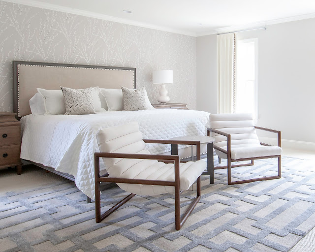
The master bedroom needed finishing off as well. With all the furniture in place we simply added an accent wall paper, rug, curtains, accessories and a small sitting space. It went from simple and somewhat plain to a little more styled.
The master bedroom needed finishing off as well. With all the furniture in place we simply added an accent wall paper, rug, curtains, accessories and a small sitting space. It went from simple and somewhat plain to a little more styled.


