Hey . .
"Fresh" is the word I would use for a current project I am working on with Heather McLeod. When she came to me for help with her house . . she used a phrase that has now become the McLeod-ism at Lucy and Company . . . "let me noodle on it." It's appropriate for many-a conversation amongst us girls now . . Heather's house did not fit her bubbly and cute personality, the time had come to brighten and fun it up. While I rarely paint first, in this case we just couldn't stand it - so we painted everything a nice bright white and soothing cool pale gray, two colors that go with most anything but definitely work with the look we knew we wanted to go with.
She wanted pops of color and kept referring back to "Kate Spade." She loved the rose image on the walls of their stores and she love the mix in of black and white . . . Rather than having her house look like a Kate Spade showroom (which frankly would have been fabulous) . . . I found this image as my inspiration for her Foyer, and that's were I started - right at the front door.
We used Schumacher's black & white butterfly and bird paper as an accent wall in the Foyer . .
Here's Heather pointing out her front door and thinking . . .
"Hey . . . We need to paint the door .."
Yes, I know... but isn't the paper pretty ! I also love the Stark black and white stairwell carpet we added up the stairs and down the long upstairs hall. For this look we kept all the walls white, but then pulled in a pale gray in the front Living Room and Dining Room off the Foyer.
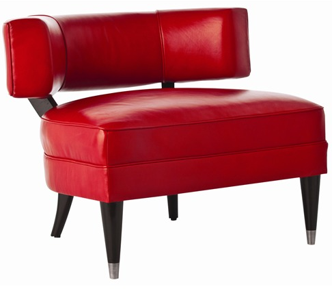
My design board for her front Living Room. This family and this house is not formal. We chose to use the front room as her "Office" and a Sitting Room, but not in the traditional way. Her desk is a unique Dining Table paired with an large ottoman doubling as seating for "coffee talk" with visitors. We recovered a pair of chairs and added a hide to define the conversation space. Heather love my "Chair of the Day" so I ordered one for her . . it's perfect. I had my carpenter make a long storage piece reminiscent of a style I designed for a girl's room about a year ago. Different application . . totally works. We are added two large lamps and a busy and sentimental grouping of art and family photos !
We took the black and white into the powder room with this paper, and added an odd but cool fixture and mirror.
Now, if we could just get our hands on Lulu Dk's amazing piece for the upcoming Family Room !!
This is the direction I would go in their family room . . let's see if she's game?
So Kate Spade... thanks for the color inspiration !
Happy Day


