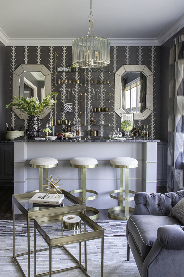
Along with the fabulous bar we shot the other day, Mekenzie shot the dining room we put together a while back but hadn't had time to shoot. Such a pretty space. Right by the front door it really does set the tone for this home. We worked on this design at the same time as the living room and kitchen and when the time was right $ wise we started ordering.
I love to work this way. I did a plan for this entire first floor a couple of years ago. We started with the most important space - the family room, breakfast and kitchen and have each year we've moved on to the next install. The dining room was next and finishing 2017 was the bar (previous post). Wonder what's up for 2018 !
Ok, so the dining room . . . take a look at the board I created a white back.
I though this space needed the drama of a little grass cloth. Soft but pattern filled.
New table, chairs and sideboard. New curtains and rug.
Love some of the details in the furniture.
Now this room has a slight bump and angled doorway making this space not completely square. It was good in this case as I wanted to add a tall mirrored storage piece. As a result we shifted the chandelier and table a bit creating a clear walking area.
Gorgeous !
Wanted to show the tie back to the earlier room we started with. The Family Room was first with a new sectional and large rug. Added lots of details in this wide open to the kitchen space.
photos by mekenzie loli


