Showing posts with label first floor design plan. Show all posts

2.09.2015

A Plan vs A Single Purchase. . . Project Five.

Hi There . . 

Around Christmas time a very cute Greek walked in our office asking about a console/storage piece he and his wife had seen on our website.  He loved it and wanted it.  Happy to order one for him, but of course we started talking about his new home, mainly to keep him sitting in our office so we could just look at his pretty self.  His enthusiasm for design and baby arriving any day kept us all talking. He seemed to love design and by the sound of it, had great taste.  He had already chosen some really cool pieces.

After a while we had convinced him that a design plan would be the best way to move forward on finishing his new home.  Gorgeous, large and full of unique pieces it was missing some big "pulling together" ideas.  An empty dining room and master bedroom that needed a plan.  The great room had a large sectional, but needed everything else as well.  

Maggie and I loved their sense of style and the lighting they had chosen on this new build but we urged him to let us help create a plan for their home as oppose to shopping for a piece here and a piece there.  I find that it can be your biggest mistake.  Impulse purchases of cool pieces is great and fun, but we often without thinking it all through.  Having a plan makes it so much easier when out there shopping or when managing your decorating budget.

Over Christmas break Maggie worked on their master bedroom, dining room and great room.  We were excited to do a drive-by over the holiday in a casual way to show them what we came up with, and meet their new baby girl !  

She started with a plan for the Master Bedroom and pulled colors from the existing color choices they had chosen throughout the house.  They had picked out a Stark carpet for the Dining Room - the Navy Antilocarpa, one of our favorites.  Look familiar?  I used it in my previous post in a Music Room.  It was one of their choices, but when we started pulling it all together we decided using it in the foyer for a large "T" shaped runner was a much better idea than the Dining Room.


Why?  To have a runner in your foyer that isn't dinky you have to order cut carpet and have it custom cut and bound to fit the space if you want it perfect.  That is the least expensive way to go.  Of course a custom runner can always be ordered by many rug vendors, but can be expensive and take a while.  With the Antilocarpa right in the Foyer paired with neutral walls, bringing the navy back into the adjacent Dining Room would bring it together so that was Maggie's plan.

The Dining Room incorporates a navy grass cloth for high texture, mixed with a sleek off-white console storage to pop off the dark walls.  They had already installed the most beautiful chandeliers, Maggie played off that too.  Their dining table is black so new side chairs with an interesting back design in black as well was a great choice.  But the end chairs in the gradating ombre fabric had to be my favorite element.  We were recently shown this fabric by one of our reps during an impromptu drive by with a new collection to show us. Take a look.


Having it run darker down to lighter on the end chairs - pretty fab !


Art was another element we wanted to pull in as oppose to a mirror.  We found a great new vendor at market that offers beautiful reproductions.  At their price points it will free up a little more of the budget for the additional things we need !

Take a look at some of our favorites from that vendor - now all available from us at Lucy and Company.


The gold chandelier compliments two wall sconces on the buffet wall.


And this grass cloth has a little silver running through it.


Soft and subtle grey rug with this simple pattern as not to fight the Antilocarpa just five feet away.


The Master Bedroom has an upholstered bed in grey and needs a plan to fill the rest of the space.  Keeping in the colors of the entire home Maggie pulled a wall paper for the bed wall which continued across the ceiling creating a canopy type effect.  Matching navy lacquer side chest and lamps.


Funny enough the window treatments they had chosen was a pattern Maggie has recently used in the Edgerton Dining Room which turned out so gorgeous... so we kept it in the plan.


A simple chaise and side stoop along with two sconces flanking the windows.


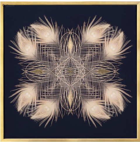
I love this art piece for the opposite walls.  Custom, unique and perfect - cause you know we are on a bit of a feather kick.


Heading back down the stairs to the great room, the ceilings are tall, tall.  With a gorgeous and very large fireplace, unique horizontal planking on either side, our suggestion was to have two pieces made for either side.  One tall, one shorter but with a large art piece over bringing it to the same height as the opposite side.  These pieces have a grey stained circle detail and either antique mirror or possibly upholstery - we haven't decided yet.  A sleek channel back swivel chair, metal and wood inlay round coffee table and tribal rug all complimenting the large sectional they have.


This fixture I love.  We have one in our showroom.  With the two story height of their ceiling we are making one that will fit the space a little better, but this is our inspiration.
Art is so important and this piece by Kelly O'Neal is perfect, we think.


Lastly, this console on a blank wall on the way to the kitchen with a gold, highly ornate mirror and off center lamp a top.  Love the mix of styles !


So there you have it.  Our plan for the downstairs as well as the Master Bedroom.  This way you have a vision, and can plan your expenses.  We are starting right at the front door and working our way forward, can't wait !!!


1.01.2015

New House . . New Plan !

Hi There

Happy New Year !!  I cannot wait to see what 2015 brings.  Last year was a really, really good one, but with some of the new projects on the books for this year it is starting off with a bang !  Having a "break" from the day-to-day office stuff gives me time with the family and time to be creative.  I am an early morning creative, that's for sure.  Working on design boards early is my thing.  It's so quite. Our goal, mine and Maggie's, was to finish the design work on 6 new projects.  I worked on Holly's master and office, Traci's master and siting room, and now my big one . . . Rebecca's first floor ! Meanwhile Maggie is focused on a very modern playroom for a Olga, a teen room for Christopher and master for the Karagounis'.  F U N ! We both agree - this is the fun part - that year end filing . . not so much - but will say, Lucy came to the office with me and banged out most of it!  Add that girl to the payroll.

Posting all my ideas for Rebecca's first floor here, 'cause I am so excited !  Love this project as it's primarily a clean slate!  I have known and worked with her in the past, but with the new house I am excited to take the things I have had made for her in the past and incorporate them into a larger, newer home.  Exciting.  I asked her "what do you want your pop color to be?"  Her response - "I trust you" and ". . . I want it to be a pop - funky, fun, interesting.  Don't really have a color in mind."

Awesome . . I get to play with a color combination I love.  This is where I landed !! Mint, navy, chocolate brown, grey, oyster and a tiny dose of carmel.


I started in the dining room.  It needed everything.  I fell in love with this wall paper when I did it in a different color version recently.  Here's my instagram shot (Mekenzie is shooting that entire project soon !! Can't wait)  Don't you love this !!! We used it on a ceiling, but plan to use in Rebecca's dining room on all the walls - in the chocolate version.


It's an Osborne & Little - Nina Campbell, very graphic and rich pattern.  With the gorgeous white wainscoting it makes for a really strong statement !  The chandelier - we picked a while back for her old dining room and I still love, love it.  It's all drippy and organic (to soften the paper).   A new dining table with a killer burl wood top and chrome legs and pale grey upholstered chairs.  For color -  and a big splashy piece of art by Heather Day is the plan.


Now -  here's the "different" part.  I want to off center the table.  I know, a little different.  I want to make a custom armless, tight back "sofa" on the left wall, move the chandelier over it and surround it with upholstered chairs.  Why?  Why not.  My plan is to add this gorgeous, tall,  china cabinet with mirror front.  My thought is this . . . how often do you really "use" a formal dining room?  Let's make this room somewhat "multi functional."  It's a beautiful space to set up for a party, or an intimate dinner, or most of the time - a gorgeous "cut through" as most of our dining rooms are, and . . easy access to the storage cabinet (which is so big, the top can be used as a "bar" as well as house all her china).  We'll see if this idea flies.  Window treatments in a soft, gorgeous mint-ish, teal a  "pop" color - which will be pulled into the other rooms.  The rug has a pattern that is forgiving as well if anything lands on it (patterns do that).


The dining room bleeds into the family room.  We placed a large 10 x 10 grey sectional when they moved in, and the chocolate swivel chairs and floor lamp we chose for their old house.    All good, just want to add a console table (live edge wood with metal base), two shorter lamps (so from the kitchen you can see the TV) and some new pillows, in the colors I want to use in this project.  The two bookcases currently are black . . . too heavy for me and make that side of the room look unbalanced with the white kitchen cabinets on the other side.  I want to paint them and maybe add a little grass cloth on the back that has a thread of teal in it.


Just behind the family room in this open floor plan is a perfect white kitchen.  I wouldn't change a thing.  To the side of that , a cozy - killer, breakfast nook.  Currently it has a custom table and upholstered bench we did just when they moved in.  LOVE - but want to finish it off.  Plan is to paper the three walls in this subtle but fab paper with a faded animal print.  It doesn't really scream animal at you, but adds a layer of pattern to cozy up this large, large open floor plan family room and kitchen.  My favorite thing of all is the cornice and "faux" blind fabric.  This one fabric really defines the color palette I chose for this house.  It's modern, graphic and has such an unexpected combination of colors.  A new lucite chandelier - larger than the one she has to tie back to the vintage lucite chairs she found.  A few black and white family pics, and we are good !


The front of the house, and on the opposite side of the dining room you wander into the front "formal" living room, and side "office."  Next to the foyer, this is the first thing you see.  I want to keep it simple, but interesting.  Now she has 4 chairs already . . . not sure if I can convince her to relocate them, but I am gonna try.  Want to add a grey (maybe leather) very modern, metal leg sofa with two really cool, tall, mint-ish teal velvet chairs.  Love these things, modern take on a classic wingback.  Funky side table, and her existing floor lamps, chandelier and art.  New curtain panels, blinds and rug.


This rug, super thick and soft.  Reminds me of a big sweater and I love that.
This fabric, love too.  Looks hand painted and will be gorgeous on the windows over the texture of the bamboo blinds.


Office, really just part of the living room, but behind really pretty french doors.   Offices can be pretty and should be treated as part of the living space.  Make them interesting !!!  Plan . . darker charcoal walls, but light furniture and very cool, textured art.  These two art pieces are actually dimensional with hand made stained paper overlay.  The two, somewhat Asian inspired pieces, are file cabinets and the prettiest I have every seen.  Found them for Holly's office space and bringing them back this this one because I have yet to find pretty file cabinets out there !! A cream shagreen desk and funky pattern rug.  Bringing back her beat up brown leather chair that is so cool and the perfect size.  Desk chair - we are making them "custom" now because there are next to no options out there . . so I am making it, but it will still roll and swivel.  Covering in another killer "hand painted looking" velvet fabric in a splashy navy.


And lastly, the entry foyer (and powder room).  Something strong to set the tone.  She has the overhead fixture and piano, but that's it.  Want to add crazy, crazy textured paper.  Phillip Jeffries charcoal circle.  Now there are a lot of doors and white trim, so this color will totally work and add the drama every foyer needs !!!!


The surprises are over yet,  have to have this paper in the foyer / hallway powder room.  It is so fun.  Powder rooms are the place to do it for sure, and it brings in the mint-ish green / teal I want as the pop color in the house.


So there you have it.  A first floor design for  Rebecca !!  
And Rebecca, if you are reading - surprise !  Hope this post really gives you something fun to read, think about and ponder until we see each other next week - excited!