8.27.2016

Time for An Update !

Hi !

It has been a long summer!  I am so ready for the Fall and with school starting Monday I can see the light at the end of the crazy summer tunnel.  Now don't get me wrong, I love spending time with the kids and take a trip or two, new adventures and old favorites, but work wise I feel like I've been traveling and installing since June with 4 full houses, two out-of-towners, and several single room projects filtered in on the other days.  Bree also got married last weekend !  She amazed me by pulling off the perfect wedding all while staying on top of the orchestrating at the office !  Maggie has been running around as well on several of her own projects, and moving in to her new digs !!   But next week we wrap up the last of the out-of-towners - the Miami job.  So seeing school start and the end of summer I so near, I am breathing a big 'ole sigh ! We may have time to actually shop for the perfect pumpkin !

I've been working on two new Fall projects and feel like I have a jump on them, having gotten the green light on both.  Thrilled both clients loved the designs and the tweaking was minor which I love. Both spaces are paying a nod to a particular look I am so drawn to.  A clean black and white palette.

Take a look at the first of two.  On this project I asked Ben Collins of The Salins Group to jump in and help me with the exterior renovation - a new outdoor living space.  I am working on the pretty and the renovation of the interior living space and kitchen.  It is time for an update and I am loving this plan.


New large black iron windows and door to the outdoor space.  Visually it will feel like the outside is part of the living room with all this gorgeous light !  I cannot wait.

New sofa and chairs all on top of a new rug.  Plenty of new accents pieces and a touch of new paper.


The kitchen is open to the living room as well and I figured . . while we were ripping things out . . . we could change the large current island to, well, a larger one but in a T shape with new counter stools.   Fresh paint and a new counter tops.  A fresh new feel and look.


The plans are done for the outdoor space and just yesterday the demo began.  This space will be much used I know !


While I not a fan of the compete Restoration Hardware / Crate and Barrel outdoor look, must admit a lot of their pieces are unbeatable as far as price and style !  Filtering some unique accessories will change it up from a complete "showroom look."  

These chairs for example - love and on sale now !!


So I am most excited to see this get into motion.  Stay tuned for design no 2 for client no. 2 !


Install of the Day !
Hi !

The last of our installs this past week was Maggie's s nursery design for Erin Noland.  Expecting her first, the look was definitely sweet baby girl.  I love the wall paper that kicked it all off.  A paper that comes in several color ways and we have used in a dining room and office - here to show you the same paper in a nursery and how it takes on a whole new feel !  Little touches of pink and grey with sweet details and accessories, it turned out so pretty in time for her shower.  Kudos Maggie.

Take a look !


photos by mekenzie loli


Install of the Day !

Yo.

While I am working on the entire downstairs at the Filman-Carter home, our last install upstairs was daughter number three - Lily's room.  She wanted - a "den" feeling, the Serengeti, and a punching bag, yep that's what I said.

This room, small as well, was a huge challenge.  With closet doors, entry door, 8 foot ceiling and an overall small floor plan the loft bed idea was something I really didn't want to do.  It can be first of all a pain to make up and just something that eventually runs its course and you have to get it out of there, not to mention expensive.  I had this idea to center the new dresser in the room and create fabric panels on two sides of it. This created a cozy and tucked away sleeping and lounging area, keeping the floor open for that requested punching bag !  Leaf patterns, distressed wood and the stamped hide rug with zebra pattern finished it all off for a walk down the animal trail.   Different for sure . . .  What do you think?


I had a low upholstered headboard made to run down the side of the bed creating both a "sofa" and a bed.  The same fabric as the headboard falls at the head of the bed from the ceiling.


I love this rug - have one in my office !


all photos by mekenzie loli


Such fun working on the Filman girl's rooms, stay tuned for the downstairs !!!


Install of the Day !

Hey !

Sister no. 2, the youngest.  Her only request, curtains around her bed.  A simple thing (and something we can easily ditch when the novelty wears off - lol).  How pretty is this space.  The wall paper IS the room and it's gorgeous.  The look of hand painted flowers, subtle with it's simple brush strokes in shades of pink and navy.  It's a small room and she's a small girl - so we pulled in a simple four-poster bed, layered a rug and sheepskin, new side table and dresser.  Not a ton of furniture, but impactful for sure.

Take a look at Catie's room.


She may be young, but designing a little more grown up will give you lasting power !

all photos by mekenzie loli


Install of the Day !

Hey !

When you have three girls, each with different personalities, all needing rooms in a new house, what fun it is to create and actually see come together!  I had several requests when working on this project - soft, tactile, grown up, cozy, all with a little boho vibe.  I think we got it ! While it didn't cross my mind at the time,  the book - Where the Wild Things Are is a favorite and the room has the feeling, so yay!  What thrilled me the most, my Kate, all of 12 accessorized it herself for us - perfect job.  I think I am rubbing off on her . . .

Take a look at this new teen room for Emma, the color combination - charcoal and white with a touch of lavender and mint.


all photos by mekenzie loli


Install of the Day !

Hi.

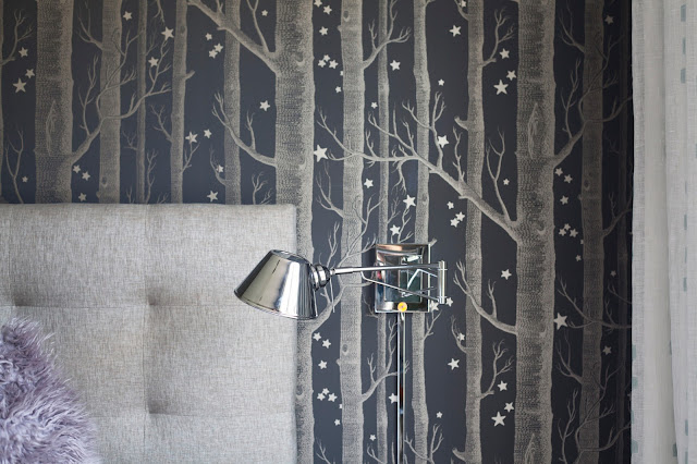
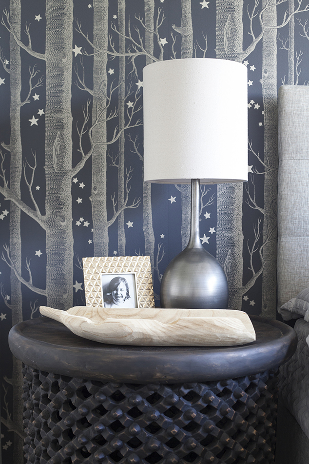
Maggie installed a master bedroom this past week and I am loving how striking it turned out !  A little accent wallpaper for pattern and texture (and fills that void over the bed most folks are bothered by), gorgeous new chandelier, the perfect rug and a big pop of navy.  Love it.

Take a look at the details !


all photos by mekenzie loli


Great Job Mags