Showing posts with label moore. Show all posts

5.01.2015

Install of the Day !

Hi There !

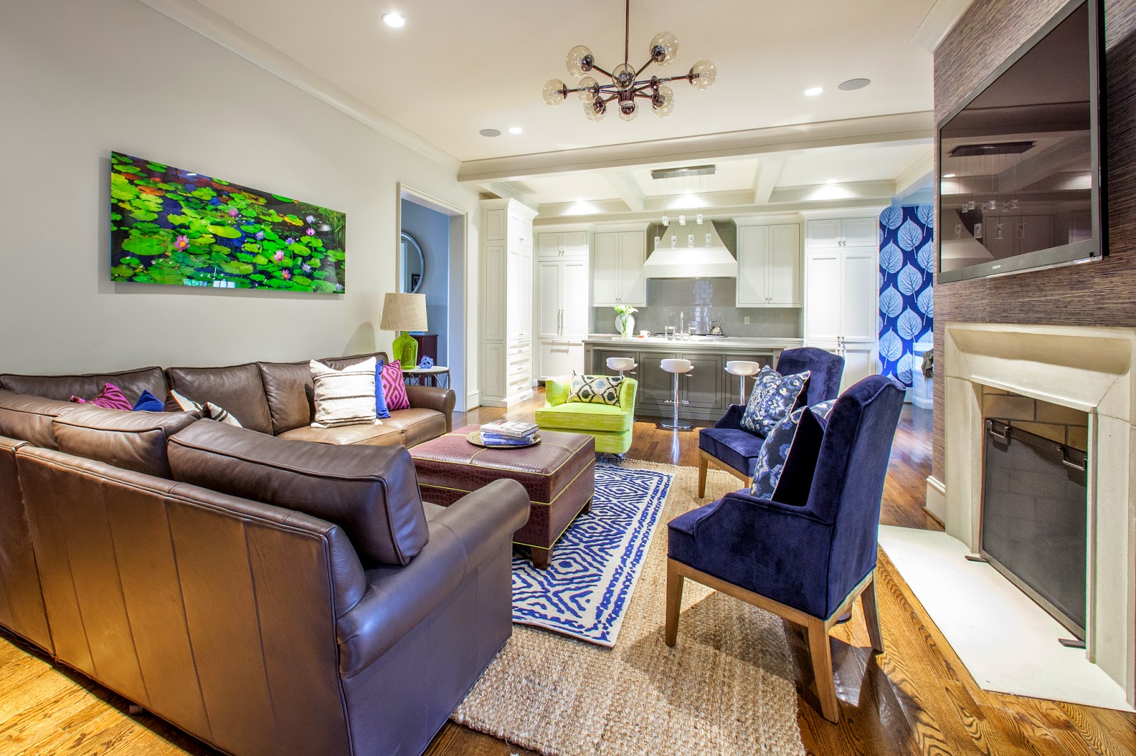
The Moore's have a beautiful new home in Myers Park.  I loved it from the minute I pulled in the driveway.  New build with great detail and the perfect floor plan.  With a busy career and school commitments leaving them limited time, they called me for help pulling together their main living space. This couple, one a little more conservative when it comes to color, the other who loves color. My job was to keep both happy by giving it a little color punch and incorporating some unique pieces to compliment their existing chocolate leather sectional !

I worked around one major key piece, a gorgeous photo by Peter Lik.  The colors, green, navy, chocolate and a touch of plum.  Was very excited to install it all this week for a big, complete reveal. 

Take a look at where I started pulling my inspiration.


With their Peter Lik having such a presence in the room, their chocolate sofa and newly painted, light taupe walls, incorporating additional pieces that compliment was important.  I wanted a "finished" look for these two.  A few days before the install I shopped to collect accessories for the bookcase case I ordered, pillows and other details.  This is always my favorite part !


The much awaited bookcase (literally came in the day of our install) helped in visually filling an empty walls and was styled with simple, yet unique found pieces (thanks Slate an Cotswold).  Color tones were very similar and on a large scale as not to look too cluttered.


On the opposite wall for balance I added another rustic console table with the same metal legs as the sofa side table.  Over top, a white lamp deliberately picked to visually balance the white accessories on the bookcase.  The lily pad plates - perfect with the Peter Lik !!!


Let the layering begin in the center of the room.  A larger jute rug, with a smaller rug for color.  An ottoman in plum croc pipped in the acid green.


I chose a neutral linen for the windows to blend into the wall and not fight the bookcase and console yet touched with a bit of plum trim on the lead edge.


Though it was overcast outside, Mekenzie captured the feel of this space and all it's details !


 My pop, for Katie, came in the way of pillows mainly.  I pulled a touch of fushcia from the artwork to bounce off the brown leather, but toned it back down with navy as not to be too wild !!


 Last minute change to the side table... of course the one I chose was back ordered until June . . this piece actually worked out perfectly with the marble top to compliment the island nearby and metal legs to jive with the other pieces.


I love the view into the gorgeous kitchen they have !!


Really love their kitchen and breakfast nook.  Perfect as is, I just decided a pop of navy in the nook would help in giving it major impact.  Josh loved this leaf pattern paper . . good choice !


Ok, so I love this idea . . . they had a large dining table in this nook.  It fit, but it look too big to me and shimmying around it to sit, seemed a pain.  I suggested two square zinc tables and have to say... love how it worked ... easy to access and love the metal !  We moved the dining table to the empty dining room, perfect.


Such a clean, functional, gorgeous kitchen !


photos by Mekenzie France

Such a pleasure working with Katie and Josh!  

Happy Friday xoxo


2.04.2015

Inspired by Peter Lik . . . Project One.

Hey There!

Working like crazy women at the studio lately, it always gets that way this time of year.  I think it's a combination of a New Year - wanting a new look, and lucky bonus recipients.  Maggie and I have met with several new clients and happily they are on board with the plans we came up with.

One of our first projects is the Moore home.  Catherine came to me asking for help kicking off a look for their first floor.  They recently moved into the prettiest new home.  It's big and has beefy moldings, counter tops, kitchens and baths.   For a new build, I was most impressed with the details this builder put in!  They just need help with design, furniture, a little color, accessories - ya know - a pulled together look.  We are staring in the most used room of the house. - the kitchen, breakfast area and family room, a blank slate with the exception of one brown leather sectional.

Take a look at the space.


Nice, right !  So . . . they own this piece by Peter Lik, a photographer from Australia,  most known for his nature and panoramic landscapes.  It centers the large wall over their sectional.  I am starting there . . . and pulling all my colors from this one piece, that we all love.  A great starting point.


I focused on navy.  While Catherine admits she could "live in a fun house," her husband is a bit more toned down.  I figured navy (paired with the painting and the color of the existing walls and trim that I don't want to re-paint) would be safe, yet striking (and he'd go for it).  But not to worry, I'll pull in a punch or two !  This is the color palette and direction we are heading in.


Keeping their sectional, I added the layered rug look for two reasons.  They needed a big rug for this space and jute is inexpensive . . . we can go big with that.  The overlay rug, not so inexpensive, so going smaller and overlaying will give me pop of color I was looking for.  A new overhead to compliment the kitchen lights.  A new upholstered ottoman and side table.  I plan on filtering in two fuchsia chairs I found for her (and hopping Josh won't freak out!)


A touch of grass cloth opposite the sofa to give the TV wall some interest.


Paper just in the breakfast nook.  Josh really loved this one pattern.  They have a large dining table in this area which is really pretty but too big I thought.  Suggested they move it into the empty dining room and for a new idea, these two 42" square tables in zinc metal.  With two, the access is easier and they are pretty interesting and different.  New, custom upholstered bench seats.


Flanking the on window on the longest wall, one tall bookcase with a graphic, interesting shape in reclaimed wood.  On the other side a tall console, also in reclaimed wood and metal.

What are those things over the console . . . really cool ceramic plates.  I plan on clustering an odd number to create a great focal point and tie back to the art.

The trim on the simple window treatments is gorgeous and adds that pop of color.  From a new vendor, their colors and options are big. . . love it !


Take a closer look at some of these awesome new trims.


I cannot wait to get this going for them.  A pulled together space.  Yay !


Once the family room and kitchen are complete - we plan on hitting the dining room.  I went ahead and pulled ideas so they could visualize.  This room should be a dramatic, casual yet elegant.  Right by the front door I have always felt a dining room is a place to be a dramatic and eye catching.


Bringing the navy back in the front of the house in either a paper or lacquer paint job.  Simple window treatments and big art.  Since I talked them into moving their kitchen table in this space I worked off it's style to mix two different types of chairs, casual yet comfortable.  The side chairs in a neutral the end chairs with a gorgeous contrast velvet on the back in an ombre effect.


A lighter sideboard (and upholstered chairs) would really pop off the dark walls, but bringing back an amazing wood mirror would tie the table back in. 


I love this mirror.  I chose it recently for the Crowder dining room install in the lighter color and it's such a show stopper . . . shagreen - love !


Lastly the plan is to bring back the same linen curtains as we put in the family room, minus the trim.  Keeping that simple and elegant, but then possibly adding an interesting plate collection on either side!


I am really excited to get this underway !!!  Stay tuned.