Hi There !
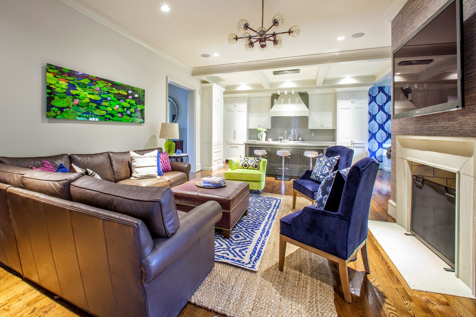
The Moore's have a beautiful new home in Myers Park. I loved it from the minute I pulled in the driveway. New build with great detail and the perfect floor plan. With a busy career and school commitments leaving them limited time, they called me for help pulling together their main living space. This couple, one a little more conservative when it comes to color, the other who loves color. My job was to keep both happy by giving it a little color punch and incorporating some unique pieces to compliment their existing chocolate leather sectional !
I worked around one major key piece, a gorgeous photo by Peter Lik. The colors, green, navy, chocolate and a touch of plum. Was very excited to install it all this week for a big, complete reveal.
Take a look at where I started pulling my inspiration.
With their Peter Lik having such a presence in the room, their chocolate sofa and newly painted, light taupe walls, incorporating additional pieces that compliment was important. I wanted a "finished" look for these two. A few days before the install I shopped to collect accessories for the bookcase case I ordered, pillows and other details. This is always my favorite part !
The much awaited bookcase (literally came in the day of our install) helped in visually filling an empty walls and was styled with simple, yet unique found pieces (thanks Slate an Cotswold). Color tones were very similar and on a large scale as not to look too cluttered.
On the opposite wall for balance I added another rustic console table with the same metal legs as the sofa side table. Over top, a white lamp deliberately picked to visually balance the white accessories on the bookcase. The lily pad plates - perfect with the Peter Lik !!!
Let the layering begin in the center of the room. A larger jute rug, with a smaller rug for color. An ottoman in plum croc pipped in the acid green.
I chose a neutral linen for the windows to blend into the wall and not fight the bookcase and console yet touched with a bit of plum trim on the lead edge.
Though it was overcast outside, Mekenzie captured the feel of this space and all it's details !
My pop, for Katie, came in the way of pillows mainly. I pulled a touch of fushcia from the artwork to bounce off the brown leather, but toned it back down with navy as not to be too wild !!
Last minute change to the side table... of course the one I chose was back ordered until June . . this piece actually worked out perfectly with the marble top to compliment the island nearby and metal legs to jive with the other pieces.
I love the view into the gorgeous kitchen they have !!
Really love their kitchen and breakfast nook. Perfect as is, I just decided a pop of navy in the nook would help in giving it major impact. Josh loved this leaf pattern paper . . good choice !
Ok, so I love this idea . . . they had a large dining table in this nook. It fit, but it look too big to me and shimmying around it to sit, seemed a pain. I suggested two square zinc tables and have to say... love how it worked ... easy to access and love the metal ! We moved the dining table to the empty dining room, perfect.
Such a clean, functional, gorgeous kitchen !
photos by Mekenzie France
Such a pleasure working with Katie and Josh!
Happy Friday xoxo


%2Bcopy.jpg)


%2Bcopy.jpg)


