Hey There !
Cohesive look, open concept, blank slate, loves all things shimmering - all words that come to me when I think of this project. My client's Joe and Diane Hogg, needed everything for their wide open, vaulted ceiling, Longview home. From the front foyer you can see a sitting room on the right, dining room on the left, large family room straight ahead, all rooms that open to each other so creating a color palette and style that melds and flows was very important to me.
Where did we start? A color combination. What did we choose? Whites, greys, blacks, metallic with a touch of teal, just a touch . . . like two pillows. Last week I decided to do a full install. What I mean by full is every single detail I felt these spaces needed. Along with the chosen and signed off items, I brought everything else I would do to complete the look for a full visual. Additional pieces, art and accessories from our showroom. This full "reveal" was something I really wanted to do for Diane. I wanted to show her exactly how all the accessories would truly complete the design. Accessories are important to really finish a look. It's a ton of work, but it's my favorite part of the job.
Funny enough, during my install, Maggie was working on a project right across the street. The van was packed full and we were hustling. Mekenzie met us at the end of the day to capture all the work.
Take a look, and I'll walk you through.
The Foyer. I kept it simple with a gorgeous, custom made round table created by my go-to for all things artistic, original and one-of-a-kind. Josh Utsey created this beautiful gold stick base table with greyish stained top. The perfect size for the curve under the stairs. I added a faux bois bowl with delicate maidenhair ferns. Simple, clean and makes a statement right as you enter the home.
Immediate to your right, the Dining Room. Diane and Joe chose this Restoration Hardware table and chairs themselves. My goal was to bring in "designer" elements dress it up. It started with the wall paper. If you know me at all, wall paper is huge with me. Seeing it finished, I can't image this room without it. Dining Rooms are the place to use it if you are considering paper. It can create such drama and you just may linger a little longer after a dinner party. It's also, typically, the first room you seen when you walk in a home so it creates a wow factor.
A crystal and distressed metal chandelier over the more casual table adds more interest. The formal mixed with casual can keep a space from looking unapproachable.
Bring in a center piece of course. I chose white hydrangeas as they were a nod to the window treatments. I wanted white and coincidentally Diane's favorite flowers.
Upholstered, tall end chairs with simple nail head trim - Restoration Hardware.
This paper, I love. Charcoal and silver with a touch of metallic shimmer. An updated traditional pattern, by one of my favorite vendors.
Maggie created this Design board and I love seeing it come to life.
As you whip around, through the foyer, you'll see a very small "lounge." This space is ideal for a simple "escape." I wanted something dramatic. Dark charcoal walls, lux fabric on the chairs and pillows with a patterned rug and the drama of unique pieces. My inspiration for the space included this gorgeous piece of art which is being created by Natural Curiosities. Didn't quite make it for the install - but on the way, it will be worth the wait.
We installed a huge five foot antique mirror, Stark antilocapra area rug and one chair . . no I didn't intend to just have one chair, the second, of course shipped but didn't make it for shoot, but you get the gist !
This rug was one of the first things Maggie chose actually. I have done it now in each of the colorways, I love that it looks completely different in each job! Available in mushroom (here), carmel, navy (here) and now this charcoal. It's a wow factor. I try hard never to duplicate things.
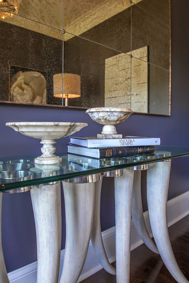
Ok, so this piece - hello. I found this console table and my heart skipped a beat. Talk about something unique, something that will not be in your neighbor's house. It's perfect. Not too heavy, pops from the wall, the perfect depth and the first thing you see when you enter the room. It's amazing . . .
Another unique piece, this set of two Ginko side tables. No two are alike and can be used together or separate. Now these I can order if any of you are dying over them as much as I am. The metallic throughout the first floor isn't overdone and the combination of gold and silver in this piece compliments the large floor lamp with a hammered gold and silver base.
The chair (. . . chairs !!) in beautiful off white cut-velvet full of texture.
Art is so important in every space. This piece by Donald Peeler (available at Shain Gallery here in Charlotte) is one of my favorites for the look and feel of this space and this home in general. Art is personal and subjective. When installing I love to bring over a piece or two for my client's to ponder. It's is so much better to see it in the space as part of the design when making a decision, but art is ultimately up to my clients as it is quite personal.
My thanks to the ladies at Shain for showing me all of Peeler's beautiful pieces and trying this one out in the space !!!
This room is all about texture and I had to include Diane's love of the furry . .
Another piece I am trying in the space, or any other room in the home now that I have a cohesive color scheme going on, is one of Annette Cossentine's piece. I came across this at Slate Interiors. I love this piece - great size, texture and color, perfect on a dark wall.

On to the Great Room. In this space needed everything. Take a look at the finished product.
A couple of things that needed to happen immediately. Aside from the fact they needed furniture both Maggie and I wanted (non-functional) window treatments to both soften the view and add a little drama. These have a simple pattern and hung high for drama.
A pair of fireplace flanking sofas and single taller chair circle the room. An upholstered ottoman with lucite legs. Touches of gold and silver are throughout the space with just a touch of teal. Two eye-catching pillows and an accessory here and there. One of my favorite things here is an art piece Keith did for me. I decided to "tack" it to the beaded board as oppose to your typical stretched canvas. I see it as casual mixed with the dressy and frankly more "artistic." One thing we are considering is stitching it to an upholstered grey linen board that covered all the beaded board, then incasing in lucite . . . hum - we're pondering all that !!
A pair of fireplace flanking sofas and single taller chair circle the room. An upholstered ottoman with lucite legs. Touches of gold and silver are throughout the space with just a touch of teal. Two eye-catching pillows and an accessory here and there. One of my favorite things here is an art piece Keith did for me. I decided to "tack" it to the beaded board as oppose to your typical stretched canvas. I see it as casual mixed with the dressy and frankly more "artistic." One thing we are considering is stitching it to an upholstered grey linen board that covered all the beaded board, then incasing in lucite . . . hum - we're pondering all that !!
Under the back stairs, this beautiful console, lamp (nod to the fireplace in color and texture) and "art." Remember it doesn't always have to be on a canvas or in a frame !
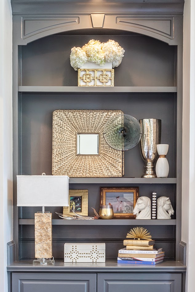
Bookcase styling is important and can be tricky. I shopped for these pieces and collected them knowing I would use most of them. The key is large scale, like colors and layered. Love how this one turned out.
All the silver and grey was warmed up with the stone of the fireplace and all the gold accents I added.
Thrilled at the Great Room finished product . . .
Standing back at the front door and looking at each room we now have a pretty, styled visual to come home to !!!
Standing back at the front door and looking at each room we now have a pretty, styled visual to come home to !!!
all photos by mekenzie france
My thanks to everyone who help me pull off all these spaces in one day . . . Maggie made great choices, Bree orchestrated all the details, installers were awesome, my artists - Keith and Josh and great local go-to's Slate and Cotswold, thank you.


