Hey There !
I have been really been looking forward to having Mekenzie shoot this install, every time I schedule it, I postpone because I have thought of something else to add. We finished Thursday with all the details I imagined. The rooms are fully accessorized and tweaked, perfect for a full shot.
The new home of Laura Ashley Brooks and Daniel Wilson in the Southpark area needed a game plan for the entire first floor. I really love coming up with a fun, cohesive game plan for multiple rooms. LA and Daniel were such fun to work with, very open to all my seemingly "out there" ideas. I thank them for trusting me. The best part of this install, right before Christmas - the decorated tree we surprised them with !
Let me take you back to our initial meeting . . . Luckily the kitchen was good and needed next to nothing, thank goodness ! It opened right into the main living room. Cabinets, finishes, coiffured ceiling - all good. My starting point was the back of the house working forward. The biggest room was the kitchen and great room, an open concept area. Starting there I spoke with LA and she told me about her love of peacock blue. So it was game on creating boards for several rooms.
The kitchen as is, was great ! I especially loved the beams on the ceiling. I wanted to bring them to life a little, so I chose this gorgeous paper set them off.
The fixture as well was good, now it just stands out a bit as well. We added new Lucite bar stools and that was it.
But over the table, we did switch out what was there (and saved it for the front office). I wanted something with a little more wow that complimented the island lighting and the living room chandelier.
Moving to the breakfast area, new dining chairs, and end hostess chairs with a back fabric in LA's choice accent color, peacock blue. Their dining table was perfect.
I knew I wanted to keep the kitchen and great room a neutral and add pops of color, so I saved the peacock blue for the walls in her front office / lounge. Many of the newer, bigger homes I work on have these large, 2 story great rooms with a center fireplace stretching up 2 stories. Having your typical built ins on either side, in this space I chose to forgo and create something different. They have a dog, a little dog, and like most of us . . we hate the ugly dog crates that usually end up in the living room or kitchen. I decided to make two flanking benches on either side of the fireplace, one being a custom dog crate ! Take a look at this image and tell me if you think it looks like a dog crate!
I designed this crate to accommodate Napolean their 5 lb chihuahua. I wanted to make it comfortable, easily accessible, warm, but most of all a piece that looked good.
Ha, I love this !!
On either side of the fireplace, were two speakers, flush in the wall. Awesome, but a pain to decorate around. My thought was to have Keith create a pair of art pieces which let the sound come through !
We stretched long pieces of hand made paper in a frame and then painted it. That was my solution kind of love it !
Two double-duty pieces.
Take a look at the entire great room and kitchen open concept!
The furniture and fabric details are another thing I love.
After I figured out the big room I worked on the foyer and the front office. I wanted something dramatic in the foyer to set the tone. When this paper came out just recently I new I was using it somewhere.. love it ! So in the foyer it went.
Don't be afraid to add art to a busy wall like this, and layer in all your accessories. I found this piece by Jan Swanson at Slate Interiors and thought it was perfect. The right colors and being dog lovers I thought they would really like it too. One of my biggest pet peeves is a small runner in a large space. Pull the trigger and have one made to fit, it just looks so much better !
The foyer leads you to the front office and dining room. The office is where I wanted to create a little color drama.
I am sure this space was built to be a formal living room. I wanted to make this a cozy office with a sitting area. A room they would actually use ! I saved the strong wall color for this space and painted all the walls with a saturated, glossy peacock blue. Eddie, my no. 1 painter used a good primer first, added a coat of semigloss, with a top coat or high gloss - brushed out to get that shine.
It's pretty wow and greets you right at the front door.
Two custom art pieces, Keith created. This one mixes in these amazing stone and gold leaf cubes from a vendor of ours. Love the texture and dimension.
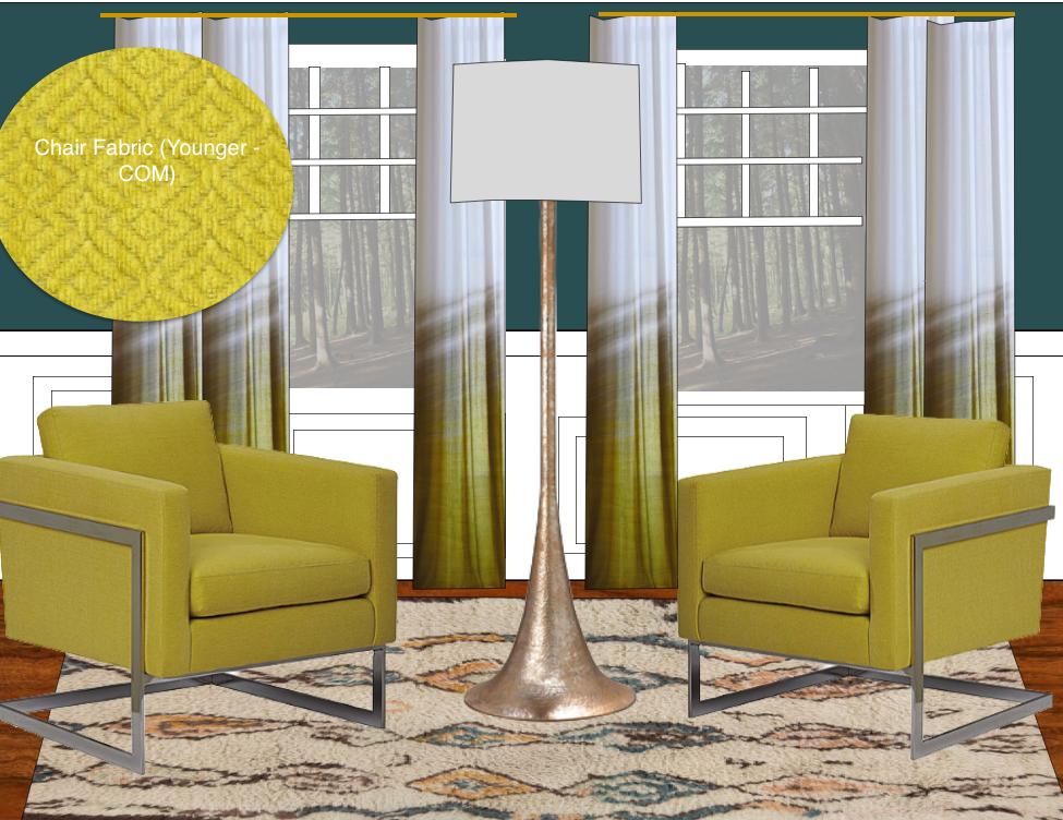
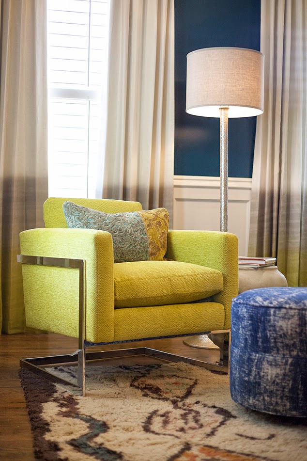
These sleek, yet comfortable chairs pop with their chartreuse chenille fabric.
This rug has always been one of my favorites, new yet with the look of something old. Shaggy and worn, with the perfect colors.
And these linen, ombre curtains, another favorite.
This is the kind of "office" I could get some creative work done in.
I really wanted to show off the coffered ceiling. We papered it with this gorgeous new Phillip Jeffries grass cloth. Love the color, it's perfect with the ombre curtains we used in there and added that texture I wanted in the space. This fixture was the one we moved from over the kitchen table. I liked it much better in this room and it complimented their foyer fixture a mere 10 feet away.
The powder room, off the great room needed a little attention as well. I pulled the orange from the pillows and rug into this space with this gorgeous paper. Have fun with your powder room, why not.
Jan Swanson made another appearance in this space. I fell in love with this bust when I saw it and though it would work well with the paper !
Jan Swanson made another appearance in this space. I fell in love with this bust when I saw it and though it would work well with the paper !
The dining room was actually a last minute addition. We had decided to paint it, being that my painters were in there already, but all the furniture was something I got the green light on at the very end. To keep it on the lower side cost wise, we recovered the seats of their existing chairs and painted their dining table in a gloss grey. The curtains, rug, sideboard, lamps and mirror were all things I found and filtered in at the bitter end... and so glad we did. I gave LA a quick design board, but I think at this point her trust level was pretty high and she just let me do it... love that, thanks Laura Ashley.
Gloss grey walls, saving the pattern for the windows. The rug actually pulls in the colors in the rest of the home, not expensive and the right look. Working with her existing chandelier, I pulled the chrome details in the sideboard and lamps. Love this quick fix.
Always trying to think of something different, centerpiece wise, I found this really pretty old punch bowl and cups. A few flowers and votive candles did the trick. I really can't get over how different their dining room table looks with about 8 coats of lacquer on it ! Thanks Chris Havey.
I had such a good time with Mekenzie shooting this first floor yesterday, she has such a technique and amazing eye ! So happy with the finished product. I think Laura Ashley might miss what I sneak in and surprise her with. . . but there's always the second floor and master !!
Happy Weekend, it's "Love" day.


