As much as I loved this summer, it was one of my busiest and I am kinda ready for a little staying home and being Labor Day Weekend and all. . . it begins, back to formal. Traveled more that I ever have this summer between our family vacation to Italy, Lucy's college drop off, and myself and Maggie went back and forth to Nashville quite a bit ! Cannot believe we have 4 jobs going on in Music City.
We recently installed his project Maggie designed and took the lead on . . . friends with my client Cindy, Stephanie and her husband are big into developing. They just finished four of the cutest homes, theirs in the middle with flanking homes for sale. Just one of their many projects. We were lucky enough to fill this new home with all new pieces for a fresh new inspiring look (also helps to give the side homes and their potential buyers a visual)
Let me give you a walk through . . .
This home reminds me of city living, going up rather than across. The living area, kitchen and small office fill the first floor with a stairwell towards the back leading you up .. and up.
Maggie chose to keep it bright and white with interesting textures and materials. She combined hide, metal, wood, glass, and inlay to name a few.
art by keith j keim
Loving Taylor Burke's chandelier mixed with this gorgeous wide Schumacher trim on the linen curtains against a light bamboo blind.
Inlay furniture . . one of my favorite things !
And watercolor velvet pillows did the trick for color pop.
The living room has a smaller breakfast area next to the kitchen, perfect for a straight banquette and a few chairs. Our client had this custom table made mixing all sorts of woods, little piece of art in and of itself
She pulled that great Schmacher trim back on a roman shade - mixing up your window treatments keep it interesting.
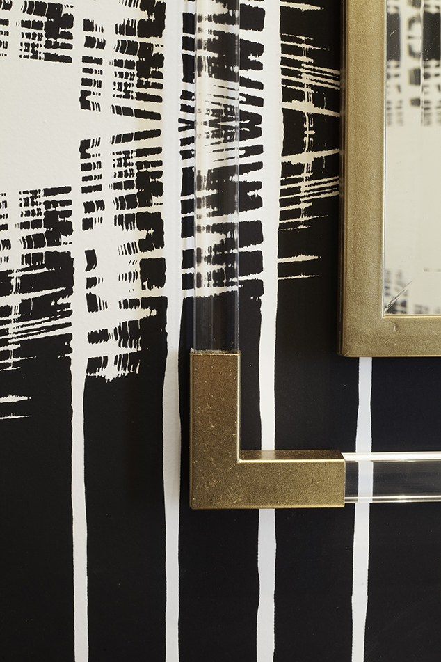
There's a small powder room under the stairs - why not give it some drama !
With touches of black throughout the house and brass accents, I love the paper she chose.
The master bedroom turned out amazing. On the second floor and down the hall, it's a little oasis. Pastels done right. An accent wall paper mixing ombre colors or mint and a pale peach, contrasts the grey washed 4 poster bed with thatched headboard a top a soft off white cream shag rug. Yum, so soothing.
I love the details in this space, especially the Jessica Zoob pillow. Her work is so soft and pretty.
Take a peek at a little of her work.
Such a calming space !
From the second floor you head up to the lounge and rooftop space. I would spend most of my time up there for sure ! Maggie ran a paper down the right wall and into the stairwell to start the vibe.
An 8 x 8 custom sectional mixed with a white lacquered storage unit, touches of brass and a neutral grey swivel chair.
All tie back to the bar area with a little mirrored tile and navy cabinets.
All leading to two rooftop decks, front and back. Wow!
all pictures by Mekenzie Loli
One down, three to go !
Loving Nashville.


