9.17.2014

Install of the Day !

Hey . . .

I hit the ground running yesterday morning, after a long weekend of amazing inspiration and low key down time with Lisa Sherry at her Luxe Life camp.  It was everything I thought it would be, so beautiful and relaxing.  Be sure and go to her site (here) and sign up for next year !

I was equally as excited to see Sheri and Eric Sayman's first floor come to life yesterday, complete with all the bells and whistles.   I loved working with those two.  They were game, enthusiastic and open to things I knew would be perfect, but they couldn't quite visualize.  I usually ask my clients to split while we are installing, for a big "reveal," but having Sherry there watching Christmas morning happen was so fun.  Never have I seen anyone more excited to see her spaces come to life.  She has anticipated a complete look for a while and I was so happy seeing her so happy !

We had a family room, kitchen, dining room, foyer and front living space to pull together, all working with the color of her newly installed storage cabinets on either side of the fireplace and grey wall color Sheri chose for this addition (The Big Chill).  That was all I had to work around, so it made my job pretty easy.

Sheri and I met and she expressed her love of graphics, and a bright pop against the soothing look of tone on tone.  She quickly fell in love with the idea of bright teals, navy and a touch of acid green and wanted to bring those colors in the space.

Take a look at their finished family room and just how we accomplished that look.


The first thing I wanted to do was add molding to the walls and layer in a grey grass cloth.  Rather than just a typical large art piece, on the big wall, I wanted to create a thoughtful "feature wall" to include two sconces and center art or mirror.  To add even a little more symmetry I asked Keith to create  two similar graphic art pieces to fill those wall panels in her pop colors.


I absolutely love these sconces, pieces Sheri was on the fence about, but I convinced her we had to have, they are my favorite element in the room.   I got lucky at Slate with the mirror which I chose to do at the last minute rather than another pieces of art.  Love.


A few more accessory details . . .


I wanted to add height to the window in this space.  A simple way to do just that is to add a blind and have it made longer than the window.  Mount it on the wall and raise the cornice.  We brought back the graphic trim on this custom cornice and covered  it in a fabric similar to the grass cloth texture.


Two smaller scale swivel chairs in a tone on tone grey, a more rustic stoop and really great art pieces I found on install day in Sheri's stash.  Love those.


The view from the kitchen into both the living space and the dining room, now has a cohesive feel and completely styled.


Don't you love the fixture Sheri found for her new kitchen !


Knowing the family room and kitchen would be finished, Sheri and Eric decided to address the front dining room, living space and foyer midway through our project.  Good idea.  Just get it done and all at once.  

In the dining room, we added new wainescoting (thank you Chris) and a Zoffany wall paper I love love in Sheri's blues with a touch of silver.  We reupholstered the front and back of her existing chairs, added window panels and a new area rug, cut to fit the space and the square table.


Her simple, yet artistic everyday china - perfect.


Simple and casual, yet with a touch of elegance in the paper choice and new shagreen mirror.


I created this organic center piece.  A wood sculpture by one of my favorite vendors with added rubber succulents and moss I found at Royal Garden here in Charlotte.  I love this, adds a little warmth and a natural feel to juxtapose the clean, sleek chrome and helps the leather chair seats and warm wood dining table seem more purposeful.


To finish off the entry foyer, we added this vintage overdye pulling in touches of the green, navy and a bit of rust color to again pulling in the dining furniture and the current rust color living room chairs.


To keep in the theme of Sheri's love of clean graphic, I found this occasional chair.  The fabric was perfect as is and the touch of antique brass ties back to the family room sconces and mirror.


. . . and let's not forget a new foyer fixture.


Lastly, the front living space.  Locating this original piece by Jan Swanson made my day.  It was long and narrow for to fit an odd, very visible wall by the front door and again, pulled in the blues and the touch of rust I needed to work around in the that space.


We repositioned her existing chairs and added a new rug, light fixture, floor lamp, and pillows.


As with all my clients, I love seeing the design boards come to life.  What I love even more - the excitement of "install day."


Such a pleasure working with Sheri and Eric and so so happy to make they house a home !
Ok Sheri, you can have people over now !!


9.07.2014

Inspired by Culture and Color, Upcoming Install !

 Hi There . .

Influenced by different cultures and incorporating pieces with an ethnic vibe not only give a space a collected feel, it adds so much interest and uniqueness.   Trending at the moment - tribal, a little dose from Africa.  Moroccan touches are filtering in rooms as well, along with treasures from India.  I am in love with the eclectic look with a feeling of history and travel.

I have a new couple who asked for help with their master bedroom.  Half of this duo hails from India. She wanted her culture present in this space.   A large room with high ceilings and, at the moment, beige walls with a pretty bed,  great bookcase and a teal sofa.  Also in the space, a rug I needed to work around.  The colors - mint, peach, teal, and a touch of rust.

It was fun working on this design board, infusing the culture of my client with touches of India and Morocco.   I worked on an eclectic space loaded with pattern and texture to compliment the rug and have the Indian feel my client so wanted.

Take a look at the pieces I needed to incorporate in my plan.


I started on the bed wall.  A large king size upholstered bed with wood trim resting on this oushak rug.  In this space I created several focal points, each wall in fact, as oppose to just the bed wall.  I brought in a wall paper with a large scale, gold medallion pattern.  In my mind, and without full knowledge of Indian culture and heritage, it's shapes and detail reminded me of the amazing carved art piece my client owns.  I am seeing a lot of precious metal incorporated in the culture, so the gold tones brought that in.  Two matching bedside tables with jewel like knobs and gold corner detail.  The lamps, more modern in shape to bring in the teal of her existing sofa.

The bedding, an off white Moroccan Wedding Blanket and dark peach velvet pillows mixed with an embroidered pillow with the perfect combination of teal, mint, taupe and cream to coordinate with the rug.


The window wall is also a focal point.  My client's sofa purchase needed to be incorporated.   

I plan on painting the remaining three walls the field color of the accent wall paper, yet punch up the entire room with a mint, gloss ceiling and these dramatic window treatments, pillows, lighting and side table.


Opposite the bed, another focal wall.  This tall and wide Henredon etagere fills the wall but lacks accessorizing.  My goal here is to bring in pieces my client has collected, and well as a few new ones creating one large "art wall" of beautiful sculptures, art and textiles.  Flanking the bookcase, two framed "torans" in a more vibrant mint stitched on peach burlap.  

I love all the detail on this wall.

The last wall in the room, to the right of the bed, a grouping of Priya's collected art.


Another thing I love about this space is it's own "foyer."  It's the perfect small space to include in the design and give it it's own beautiful look.  Incorporating another wall paper in the same tans and gold, yet with a large pattern floral.  Over top, a carved piece of art in my client's collection and two gold mirror which will introduce you to the feel on the wall paper you are walking in to.

The floor isn't neglected either.  A more modern rug in mint and taupe defines the space and a bench along the wall with a new cushion in a velvet tribal pattern.


After I created all these boards, we met and for the most part all was good !  We decided to go with my back up option of wall paper for the space behind the bed.  This paper did change what we wanted to do on the windows.  Take a look at how one paper can really change a look.


This fabric, new from Zoffany is simply gorgeous and Pyria fell in love with it.  It worked perfectly with the area rug and wall papers.


It was not only a fun and collaborative meeting with Pyria the other day, I learned a thing or two more about her culture.  My framed toran idea on the bookcase wall . . . well apparently they are sold on every corner and about a $1.00 - so we ditched them !

Cannot wait to install later this month !


9.03.2014

Install of the Day !

Hi . . .

The Front Living Room.  It doesn't have to be a boring, formal space you never land in.  The Wagonner's have just that kind of space space that was partially finished but needed some styling up to make it a major focal point as you enter the home.    I was thrilled to have two gorgeous Bernhardt chairs to work with as well as a shimmery Phillip Jeffries grass cloth.  Past client, we worked with to create a bonus room fit for the whole family (here).  Since then, I have been working my way through the home.  Keith created a huge art piece for the family room we installed yesterday as well. Next up, Powder Room tweaking and blood giving to finance the dining room I want to do !!

Where to start, on this "lounge?"  A focal point.  The room needed something on those walls to give that paper even more attention and a rug to ground everything.  

Take a look at what we installed and shot yesterday.


I started with the rug.  This large Ikat grounded the space and added a little color and texture.  I chose it for it's blue, grey and emerald green (which for me goes with most everything).  The large, large 62" round mirror became quite the focal point and filled the walls.  Out of the box, it's all black iron. I chose to added the gold leaf  (of course at the last minute as Keith was hanging on the wall).   We love, love that mirror.  A new coffee table, shagreen with gold accents, pillows, more art (created by myself and Mekenzie), a new console behind the sofa and new large lamp.  It's pulled together now !


These chairs, thankfully, had great style and fabric.  Love the hammered iron legs in a warm gold.  Fabric is a soft, textured shaved sheepskin like.  New pillows with even more texture and tie back to the blue in the graphic window treatments.


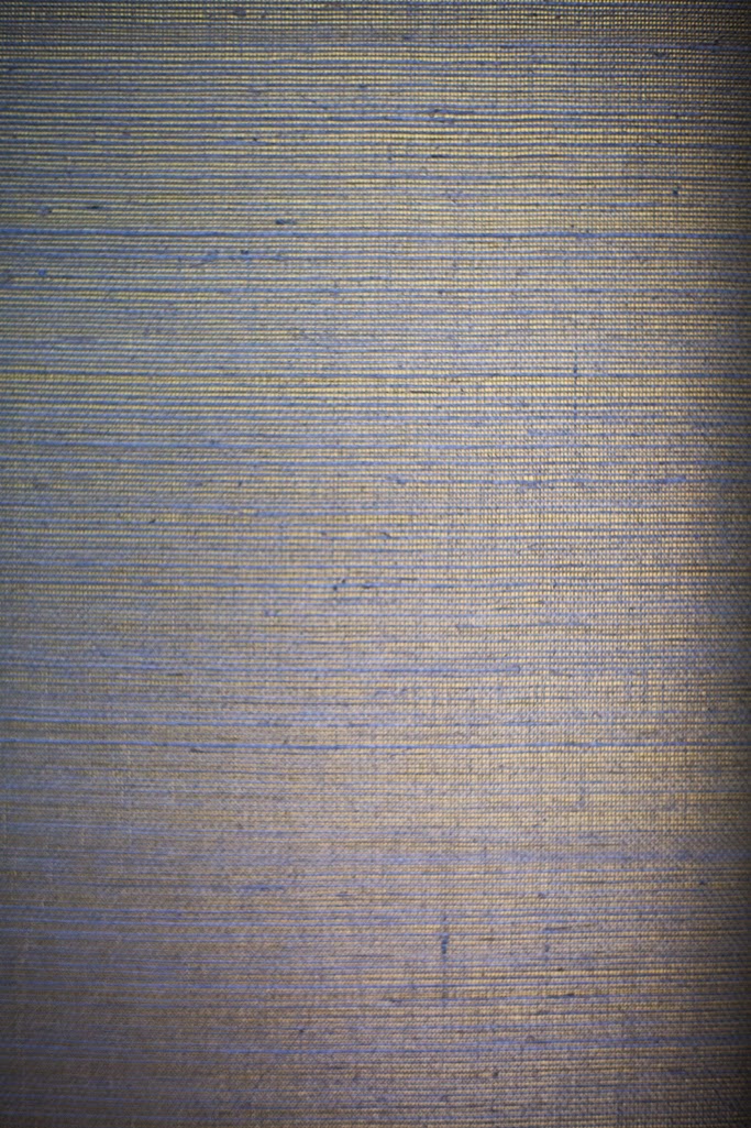
The wall covering, a Phillip Jeffries gold and slate blue combination, shimmers when the light hits it and takes on various colors. 


The shagreen coffee table was a huge find at Slate.  Shagreen is big right now.  What is it?  A type of rawhide consisting of rough untanned skin commonly made of the skins of sharks and rays.  Mine, however a faux.  No animals harmed in this install, or any install.

Take a closer look at Shagreen.


The art was a fun project that Mekenzie and I created last week at the studio.  I knew I wanted a grouping and wanted them to all be similar.  I ordered these pretty gold, with linen mat frames, from West Elm and we got to work on the textured, simple art.  Washing Bristol boards with shades of blues, greens, gold and grey then overlapping hand made papers and washing them a little more.  Lastly, adding some gold leaf.  Simple and as a group, and perfect for this space.  That art major came in handy.


We off centered the art over a new console but to the left of a large lamp.

all photos by Mekenzie France


Happy clients,  happy us.  Fun install as always at the Wagonner household.


Busy month of installs ahead stay tuned !