5.03.2015

Check Out Style Library !

Hi There

Did you miss my Style Library USA Instagram takeover (here) ? It was a fun weekend shooting images of things I was inspired by for my friends at Zoffany (one of my main go-to's for great textiles and wall coverings).  What is Style Library?  They are part of Walker Greenbank PLC, a luxury interior furnishings group of companies which design, manufacture, market and distribute wall coverings, furnishing fabrics and associated products for the consumer market.  The Walker Greenbank brands comprise of ZoffanySandersonMorris & Co.Harlequin and Scion. Targeted at the mid to upper end of the premium contract market, each brand benefits from worldwide distribution. The products can be viewed at flagship showrooms throughout the world, including the Design Centre Chelsea Harbour, London, and the D&D Building, New York.

I was also asked recently to be a guest blogger . . . I was happy to do it.  Thought I would give you a look at that post, but be sure to add their blog to your read list for inspiration and the newest intros to the world of fab fabrics and wall coverings !!!   I love them  !!!  (here)

We're delighted to have Beth Keim from North Carolina based interior designers Lucy and Company as a guest blogger. With a unique style and love for all things design, Beth has been working as an interior designer for 15 years. This long-held passion for creating special and stylish interiors has helped Lucy and Company become the flourishing business it is today. We hope you'll be inspired by seeing some of Beth's work and reading some of her top style secrets! (link here)


Art by Jessica Rowe 


Spring is really kicking in. All I want to do is coax my husband to get outside and turn our yard into a virtual botanical garden, in just one day. I want to fill all the flowerpots in the hopes they will bloom when I wake up the next morning.  I want to eat every meal on the back porch with my real china and linen napkins as if hosting a party daily.  Spring is pretty, light, fresh and warm. Spring is full of color and life.  

I am a designer who loves working with color, and multiple textures and patterns. I mix graphic angles with organic motions. I really have a love of large palms and banana leaves. In any room, any setting, bringing in that little bit of nature freshens up everything.

When working with tropical prints I tend to pull in crisp whites and a good dose of black to anchor those patterns. Every room should have some black; it adds a little “weight.” I am really crushing on black and white with a botanical touch these days.  After a recent visit to the Viceroy in Miami I was able to soak in all the details by one of my favorite designers, Ms. Kelly Wearstler. We designers find inspiration from other designers, artists, textile manufacturers both big and small as well as everyday images. I could, and have, spent hours just walking a city street, deeps in the woods, along a beach - finding shapes, lines, colors and then translating what I see into a design feel or look all my own.  My job then begins in translating what I see in my head in a visual way to my clients, via a good design board. These boards are crucial for those who just can’t see it. 

Recently I got a sneak peek at Amazilia, the new Fall collection from Harlequin due out this Summer in the US. When I saw the Paradise pattern with its artistic, loosely painted print, my heart skipped a beat. Mixing with black and white, this tropical print isn’t exclusive for your beach house . . . Take a look at how I was inspired!


I don’t shy away from multiple patterns and textures. Working on this master bedroom, I knew I wanted a big pop of pattern and color behind the bed as a focal point. I decided to fully upholster the one wall!  My upholsterer creates large, padded panels to fit perfectly on any wall or door.  Once I choose my key fabric, I play off that with multiple patterns to complement!


 Zoffany, Harlequin, Scion, Sanderson, Morris & Co., Walker Greenbank Contracts - my go to when starting a design project. Their Style Library puts all their offerings in one place. I search by color, pattern and use. The ease and accessibility makes it fast when pulling ideas. I then turn to my own showroom where all the books and samples are available to me. Take a look at a few of my favorite black and white walls papers ( H - M) and fabrics (N - S)


A. Harlequin’s Paradise 120353, B. Harlequin’s Hamadi 1655, C. Sanderso’s Ooti 231268, D. Harlequin’s Rumbia 131522, E. Harlequin’s Mirella 131066, F. Harlequin Cheree 131071, G. Harlequin’s Limosa 120339, H. Harlequin’s Oto 60777, I. Harlequin’s People 130731, J. Harlequin’s Spirit 60125, K. Harlequin’s Leaf 110373, L. Zoffany Persian Tulip ZTRA07004, M. Harlequin - Oria Kiely’s 110412, N. Harlequin’s Pure 2552,   O. Sanderson’s Tintagel 240108  P. Harlequin’s Orietta 8143,  Q. Sanderson’s Portobello 220047 R. Zoffany’s Verdi Damask 330953 S. Harlequin’s Silhouette 130329


/\/\/\/\/\/\/\/\/\/\/\/\/\/\/\/\/\/\/\/\/\

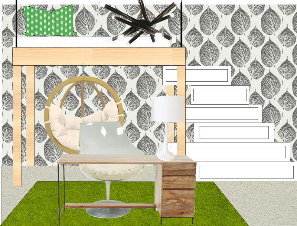
One more addition to my love of black and white, the oh-so versatile color combo, this teen room I have been working on.  Complete with a loft bed, stairs that also function as dresser drawers, a floating room desk and the ever so popular hanging chair !  Why did I choose this amazing black and white leaf paper. . . . let me count the ways . . .

>  black and white works with everything
> love the graphic pattern with the modern, clean lines of the furniture
> adds to the "being in the trees" feeling of a loft
> it's just plain cool !!!


Happy Weekend !


5.01.2015

Install of the Day !

Hi There !

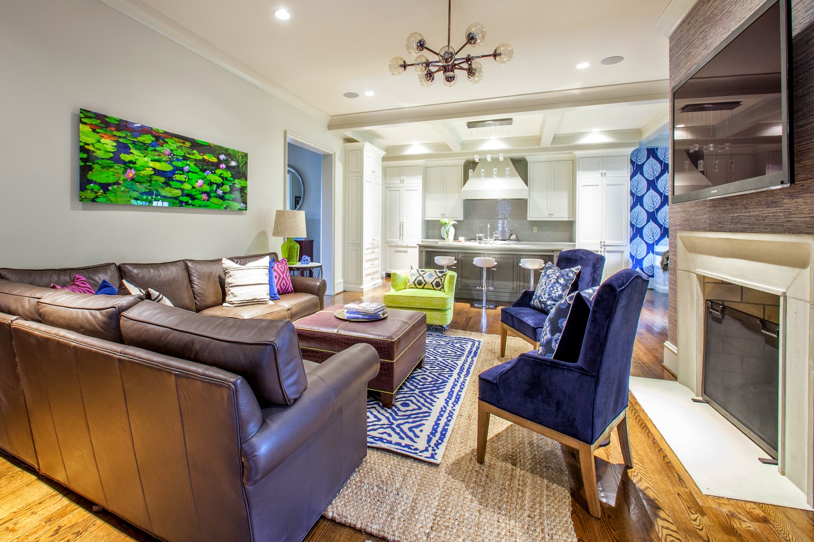
The Moore's have a beautiful new home in Myers Park.  I loved it from the minute I pulled in the driveway.  New build with great detail and the perfect floor plan.  With a busy career and school commitments leaving them limited time, they called me for help pulling together their main living space. This couple, one a little more conservative when it comes to color, the other who loves color. My job was to keep both happy by giving it a little color punch and incorporating some unique pieces to compliment their existing chocolate leather sectional !

I worked around one major key piece, a gorgeous photo by Peter Lik.  The colors, green, navy, chocolate and a touch of plum.  Was very excited to install it all this week for a big, complete reveal. 

Take a look at where I started pulling my inspiration.


With their Peter Lik having such a presence in the room, their chocolate sofa and newly painted, light taupe walls, incorporating additional pieces that compliment was important.  I wanted a "finished" look for these two.  A few days before the install I shopped to collect accessories for the bookcase case I ordered, pillows and other details.  This is always my favorite part !


The much awaited bookcase (literally came in the day of our install) helped in visually filling an empty walls and was styled with simple, yet unique found pieces (thanks Slate an Cotswold).  Color tones were very similar and on a large scale as not to look too cluttered.


On the opposite wall for balance I added another rustic console table with the same metal legs as the sofa side table.  Over top, a white lamp deliberately picked to visually balance the white accessories on the bookcase.  The lily pad plates - perfect with the Peter Lik !!!


Let the layering begin in the center of the room.  A larger jute rug, with a smaller rug for color.  An ottoman in plum croc pipped in the acid green.


I chose a neutral linen for the windows to blend into the wall and not fight the bookcase and console yet touched with a bit of plum trim on the lead edge.


Though it was overcast outside, Mekenzie captured the feel of this space and all it's details !


 My pop, for Katie, came in the way of pillows mainly.  I pulled a touch of fushcia from the artwork to bounce off the brown leather, but toned it back down with navy as not to be too wild !!


 Last minute change to the side table... of course the one I chose was back ordered until June . . this piece actually worked out perfectly with the marble top to compliment the island nearby and metal legs to jive with the other pieces.


I love the view into the gorgeous kitchen they have !!


Really love their kitchen and breakfast nook.  Perfect as is, I just decided a pop of navy in the nook would help in giving it major impact.  Josh loved this leaf pattern paper . . good choice !


Ok, so I love this idea . . . they had a large dining table in this nook.  It fit, but it look too big to me and shimmying around it to sit, seemed a pain.  I suggested two square zinc tables and have to say... love how it worked ... easy to access and love the metal !  We moved the dining table to the empty dining room, perfect.


Such a clean, functional, gorgeous kitchen !


photos by Mekenzie France

Such a pleasure working with Katie and Josh!  

Happy Friday xoxo


4.24.2015

Install of the Day !

Hey There !

Happy Friday . . . great close to the week with a trip out to Traci Shanks.  We installed and photographed her master bedroom yesterday.  Traci has been so great to work with, having completed her first floor in one fell swoop (here) we headed upstairs to transform her master!  I love this space. It brings her new pop color from downstairs up, mixed with soothing neutrals.  It's all about the details in this space !


What did we change?  Everything.  The original space had a huge, dark wood - 4 posted king bed, large wood dressers and windows with short curtains.  Traci wanted a larger looking space, open, light, pulled together with a smaller bed.  I usually don't go down in bed size for couples, but they wanted it, and it totally opened up the room !


The very first thing I wanted to change were the windows.  I see it all the time, an arch over standard windows with curtains hung below the arch.... I am here to say N-O.  It's shortens the room and then what do you do with light pouring in that arch?!  Raise the pole to the ceiling and invest in big-girl curtains I say and was so happy Traci saw the light, or in this case didn't !! These new functional window treatments draw completely on a gorgeous new track for room darkening.  Beautiful job Amy!!!  It made all the difference.  


I started working from the windows to the bed, side tables, bedding and accessories.  Choosing to work in a subtle tone-on-tone color way with just a pop of color.  Love this channel back upholstered bed, so detailed and tailored !!  Hit Bedside Manor for the perfect bedding.  It makes all the difference too.   Bedding is an investment and so worth it !!!  I'm kind of a tread count snob.


Just the other day I found the perfect end-of-bed bench in navy velvet with lucite legs, thanks Slate, perfect !!


Our pop, this beautiful linen Studio Bon fabric for just one bolster. 


Smaller bed, bigger side chests !  I worked in two pieces of art on either side, one shell, one sea fan.  I absolutely love these.  The touch of wood on the chest mixed with the white does warm things up a bit !


Opposite the bed, a navy dresser in a gorgeous grass cloth texture, two new wall sconces and a piece of art by my husband, Keith.


Are these sconces not gorgeous !!!


Attached to the main sleeping space, a small - cozy sitting room.  I chose to paint it a dramatic navy and pop it with this killer Asian inspired bookcase !  L O V E !!!  With all Traci's travels, this piece, mixed with a Moroccan inspired side table and we have touches of other cultures to create an eclectic travel inspired space.


all photos by Mekenzie France

It's all came together and we were all thrilled.  Thanks again to Traci for her never ending trust !!


It's going to be a busy week full of installs, I think we have one each day !