Hi There . . .
We finished up a home office today with a few small details. A little while back I did a post about an office design . . in 6 different color ways (check it out here). The winner was the neutral version. But in the midst of the design we added the adjoining dining room to the scope of the project. When navy was introduced into the dining room, I went back and changed the chair in the office space to bring that navy in. It was early November and I had the holiday deadline to bring back 6 recovered chairs and a new table. The office furniture also arrived fast . . for it being both market time and holiday time . . . but, I waited for the holidays to end before tacking the some-what messy job of painting their old upright piano. We finished that up the other day and I swung by today to help organize all the "not-so-pretty" office stuff.
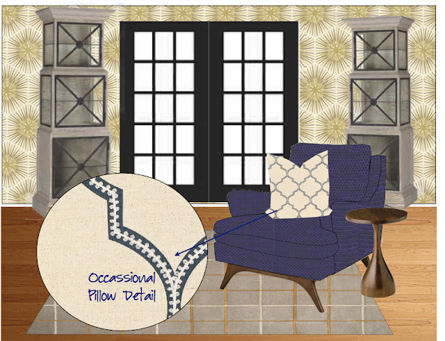
First take a look at the details for their . . . right by the front door office space, leading into the dining room . . . here's our color scheme:
We kept the upright piano in the space, no real place for it anywhere else. We also kept the windows clean, with just plantation shutters. The main focal point in this space . . the walls ! I am so loving this Zoffany paper (available at www.lucyandcompany.com). It also comes in the prettiest shades of blue.
One desk for him, one for her.
This space, in this house was clearly designed as a front living room leading to a wood paneled library. I love that it's all been re purposed to be an office and a dining room. Having said that, the two should "jive." Stephanie's design aesthetic in the home is neutral, and shades of it. I was happy she and Jon embraced the patterned paper !
Check out the finished product, Mekenzie shot today . . .
Hidell Brooks Gallery, my go - to for the most amazing art . . . This piece is by Miranda Lakes (one of my all-time favorites).
The tie into the dining room is perfect !
And how about that painted piano. . . what once was a dull wood tone, now a gloss black
I also found a few great accessories at both Slate Interiors and Cotswold Marketplace
The dining space is wood paneled with a large working fireplace. The type of room you could sit and entertain for hours. Not fussy at all. With four young kids this is the way to go!


