Soft and soothing was the name of the game this past month, and this install last Friday is another good example! When designing the home of Tracy Vaughn I took two of my favorite wall papers, (which I have yet to convince anyone to use) and placed them both in this 1,000 square foot condo.
Meet Eskayel
There are so many patterns to love, it was hard to pick one. In creating these boards, it really gave me a visual and pulling other fabrics, furniture and accessories was much easier.
Tracy is the best, she was completely game for all my choices and just let me go with it.
Her design . . take a look.
Tracy is the best, she was completely game for all my choices and just let me go with it.
Her design . . take a look.
Now with Mrs. Loli back from her honeymoon, we got together for this shoot at the end of the week.
Looks simple enough, one room and a Master Bedroom - but this job took over a week. All new floors and re-painting her dark wood kitchen cabinets from brown to white. We also painted every other surface, added a new back splash and brought in all new things. Whew ! This one wasn't a one-day thing . . . but I did convince Tracy to wait until I was done for a big reveal.
So thrilled with the result . . . simple, clean, styled and full of special pieces I saved just for Tracy. I didn't want this space to look ordinary.
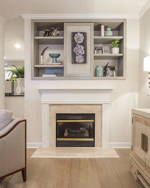
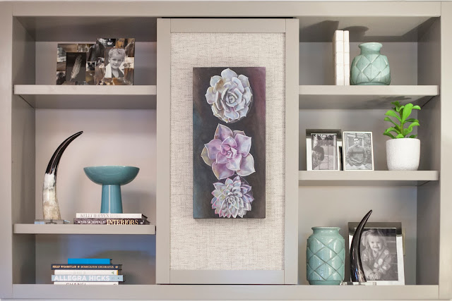
I know I stepped outside of her comfort zone and the typical placement in this space. We moved the TV from where it was "suppose" to go, to a place I though it should go. Rather than over the fireplace, I moved it to the right wall. My one and only reason was that the front door is directly oppose the fireplace. Who wants to see a TV when you want in the door. I designed this insert to go in it's place and had it installed last week. We then accessorized it with interesting finds. Much, much better than that TV.
We added two new sconces on either side of the TV, mounted to the wall. It created both the look of an entry foyer and give light to a dark wall. Bonus - it kept the cabinet free and clear of "stuff."
The window now combines blinds and panels and this custom table with vintage chairs serve as a small eating place as well as a work surface... double duty.
Lots of interesting details in this space.
art by keith j keim
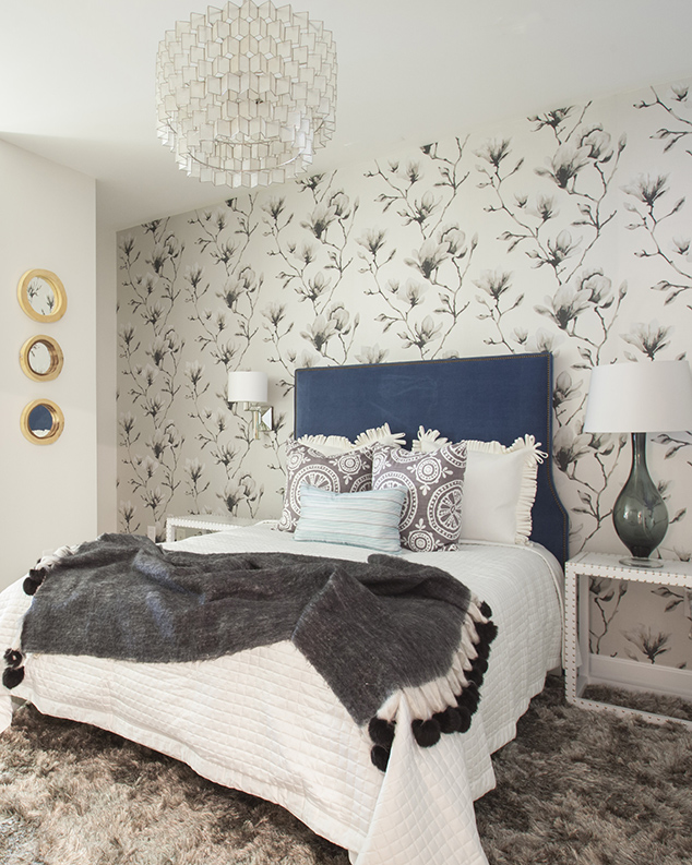
Moving to the Master Bedroom, the patterns and textures continued in a soothing and calm way, yet with a little life.
I L O V E this paper. Why it's been such a hard sell is beyond me. It's gorgeous !!!!!
Just one focal wall when you enter the room.
A new tall upholstered headboard, bedding, side tables, lamps, rug . . . well everything.
A little vintage find mirror mixed with West Elm !
I took advantage of an end of year sale or two with some of my vendors and splurged on a new, large dresser.
photos by mekenzie loli
This space was a thrill. I could not wait to call Tracy to come home and see. It was the sweetest thing receiving her text messages . . . " I live here !!" Awesome.


