7.08.2019

Finding Inspiration

Hey !

I am constantly saving Instagram images for inspiration.  Taking bits and pieces and filing away to revisit.  Vacation ideas, food ideas, and just images that make me feel good.  I will find the simplest of things to help spark inspiration on projects.  Couple of favorites I thought I'd share today, a few of which are really helping me with an upcoming project !

Ca' Pietra Tile


I adore this one - pattern:  Spitalfields Ceramic Retro Star in Black.  It's aged finish would be the perfect choice for a little project I have in mind to create that look of aged old Paris.  Sign me up too for the copper pipes and brass plumbing.  Adore this.


Ca' Pietra (here) and (here)


O'Brien Harris Cabinetry


This jumped out at me as a great visual to show my client with regards to the cabinet color and materials I want to incorporate in their new kitchen, paired with the floor color planned.  We are also using metal doors and windows as well and a gorgeous brass mesh on the pantry doors.


 O'Brian Harris (here)


While I like to think my design boards give a pretty good visual - It really helps to have a photo to show as well.  Pretty excited about this installation with one of my favorite long time clients.


She mentioned wanting this kind of hood.. great image to show the cabinet color, metal windows and amazing hood all together.


This brass shelving too is something I want to bring into their Scullery.


There is a great, large scullery from the dining room to the kitchen.  We are doing slightly darker cabinets, flat front with a custom brass shelf to the ceiling.  Super moody and dramatic.

And the back splash something new I came across and in love with !


The powder room will be pretty yummy.  I started off by wanting this gorgeous Hermes wall paper.. but alas, they discontinued the colorway.  Then I came across this one by Clay McLaurin Studio


This pattern is pretty perfect for this house and paired with a marble and brass sink.. hello.


Clay McLaurin Studio


Clay McLaurin was established in 2013 many of his beautiful patterns are nature, travel and history inspired.  Vintage fabrics are also sourced from travels world wide.
 I love his interpretations !


This project is coming up at the end of the year and it should be a beauty from the 1st floor to the 3rd!


Oly Studio


Huge fan.  Have been for a long time.  Follow their page regularly.  Love everything I see.  Saw this image and realized I have both elements in this upcoming install.  The paper, by the fabulous Kelly Wearstler (here) and this fixture we used in their original foyer which I plan on swiping and moving to the new house in the sitting room. 


Recreating the master bedroom and . . .


Moving the Oly Fixture to the new sitting room.


This should be a cozy space to get away from the huge family room, just a little corner to relax.


But follow Oly, there's so much to love.


This project is coming up at the end of the year and it should be a 
beauty from the 1st floor to the 3rd!


7.06.2019

John Derian - West Side

Hello !

Who fell in love with this 19th century Federal-style home that was, for the most part, falling apart?  John Derian of course.  I receive Cultured Magazine and there as a great bit by Mieke Ten Have from last summer... (here) that tells the story.... 

“Sometimes I get these building crushes,” says John Derian of the row of early 19th-century whitewashed buildings on Christopher Street in the West Village, where he opened an outpost of his East Village design mecca earlier this year. Derian—who started out as a purveyor of glossy decoupage accessories with a charming, if not slightly off kilter, 19th-century spirit—has become the go-to for handmade goods for the home with a romantic touch and a vintage quality.

“Retail is weird. Traffic is down, staffing is hard, but still, I thought, OK, this is meant to be,” he says, describing the space—which he had his eye on for years—as a kind of “divey old pet shop.” With a seashell-embedded fireplace in the back and rear garden, it reminded Derian of his home in Provincetown, while the front he found reminiscent of Astier de Villatte, the cult ceramics atelier in Paris with whom Derian often collaborates.

Derian is a brick-and-mortar bulwark in a retail landscape that shifts as quickly and ominously as quicksand. Since opening the East Village location in 1995, the shop has expanded, as have the makers and categories Derian sells. Whether it be lush and tactile paper flowers by Livia Cetti, whimsical drawings by Hugo Guinness or folkloric silk scarves by Nathalie Lété, Derian has a knack for finding and representing designers that interiors aesthetes fall in love with and glossy magazine editors rapturously cover.

“I have said in the past that I like looking at things. I like that sort of curiosity, and I think we need it in a way. It is an experience going through these handmade, textural things,” he says. “My shop is a destination.”

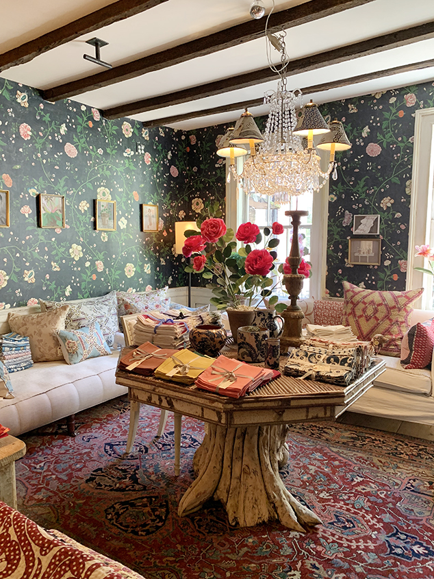
And that is the ethos of his brand: a store for people who know about it and understand it. His West Village outlet is a continuation of that theme. With 18th-century wainscoting, walls boast a “cracked, peeling patina,” achieved by using three kinds of varnish. A back room has densely patterned floral wallpaper from a collection Derian recently launched with Designers Guild. He also had custom shelving made for the austerely luxurious, milky-white glazed black terracotta Astier de Villatte collections he sells. “There is a sense of history, of authenticity, in this place,” he says.

While Derian is instinctually inclined towards past eras, he’s not in denial of contemporary demands either. “I relaunched my website a month ago; it looks great,” he says. “I had to work with people who understand it because I wasn’t sure how… how do you create a tactile place online?”

In spite of the less-than-rosy Manhattan retail outlook, Derian is optimistic about his new neighborhood. “Feedback has been positive,” he explains, recalling several recent remarks from long-time residents. “They tell me ‘all the shops used to look like this one, and now there are no more.’”


His new place on the West Side (18 Christopher Street) is filled with everything I love and when Kate and I made our way over there on our last day in NY, it took everything I had not to scoop up another big stash.  I really hate shopping on line when it comes to accessories.  I love to touch and feel and if a showroom is this gorgeous I will create a morning around it.  I love to soak up the entire vibe.


This tiny, 500 square foot space is packed to the brim with accessory heaven and I am a bit of a collector.  On each trip to the city I wander in and no doubt leave with something. 


I have had my eye on these and wanted to see in person.  Loved.  Who else loved, my girl Lauren.  Picked two, couldn't resist.


When looking to style up a kitchen, dining .. or just about any surfaces you won't leave empty handed.


Another reason for the visit was to see his new wall paper line with Designers Guild.  I carry that line and was curious ...


John's new line through Designers Guild is so pretty and seeing in person inside his beautiful space made it even more so.  While I can order a sample or get a book, being in the room filled with these textiles it seriously get my wheels turning.


photos (except for a few....  by Stephen  Kent Johnson)


Thanks John for a lovely morning !


DeVol Showroom NYC meet Jersey Ice Cream Co.

Morning !

I have been crushing on DeVol's instagram feed for a while now as well as the design work of Jersey Ice Cream Company.    Definitely a look and one I love.  Having a similar feel I thought I'd write a little about the two this Saturday morning, while in the Forest and looking for inspiration on a new project.

So on my resent trip to NYC I made it a point to go by the showroom on Bond Street which had just opened !! (here).  It was just a pretty as I pictured in my head.

Who is DeVol ?  Well you can read all about them here, or a previous post of mine here, their history and such, but in short - an amazing design firm of some 30 years specializing in beautiful English Country and French inspired kitchen design.  The look is something I would want to come home to.  It exudes cozy, home, sentimental, collected, original, sweet - just words that come to my mind when I am in space with this look.  The look isn't hard, isn't modern (though the function is), isn't cold.  It's a look that does make you want to slow down and just breath and reminiscent maybe of summers away.

Took a few pictures of their showroom.. take a look !


Love it all.  


Now what does Jersey Ice Cream Co, have to do with DeVol?  Well first of all.. nothing to do with ice cream and everything to do with design.  They are a design team who doesn't believe in out with the old and in with the new.  They transform old farmhouses in the Hudson Valley (as well as collaborate on pretty cool boutique hotels) to give their clients a unique dwelling of function and character.  Meet Tara Mangini and Percy Bright.

Their plaster walls, somewhat of a signature look, they believe add depth to a room (as do I) and their use of flea market finds, vintage pieces and an overall cohesive look is nothing short of magical. There's something special about history and age.  Creating a unique space that doesn't scream big box, chain or e-commerce.

What is their method?  They move in during the renovation, smart.  They spend their time moving from house to house leaving gorgeous renovations and designs one right after the other.


Between the two, I am finding all sorts of inspiration.  Take a look at a few images of their work.

The Minwawa Project

Staying true to the space, this 1887 Arts & Crafts home, finished, is a step back in time with it's original details.  The feel is divine. What an amazing get-a-way this would be.


I love the mis-matched chairs and dark walls.  I used a similar color in my mountain house in both a bedroom and the exterior. Client's often think it will be too dark, but it never is !


This kitchen, easy and simple with the open shelving below, gorgeous plaster wall and vintage utility sink.  Trim color does not have to be white throughout, please, please.. so much better complimenting the cabinet color. 


 Nothing better than a claw foot tub and a little afternoon natural light.  Simple ship lap and large vintage stone sink.  Leaving the wood window trim was definitely the way to go.


Bunk Room for late night chatter under the covers.


Two cozy bedrooms, I particularly love the spindle bed (have a black on in mind for phase 2 here in the Forest).  The break in the plaster walls from white to off white is such a simple thing but made all the difference.


 Maine Home

This kitchen is a showstopper for me.  I came across it a while ago.  Not only is the stove divine the slight glimmer of the tile adds such an amazing overall feet.  Located in Rockport, Maine, I can just small the lobster boil.  Timeless for sure.


The London Flat

This is probably my favorite.  I adore the colors, and not to mention it's in London, what a fun reno this must have been. So much inspiration in that city !  I am sure they found all sorts of accessories in nearby shops.


Old mantles, leather sofa, plaster walls, airy sheers and perfect.


Old Chatham Farmhouse

This is farmhouse done right.  Exposed wood joists, wide plank floors and built in cupboards.  I read they lived in the barn while working on this amazing place.


I tell people all this time a little less is best, and I mean it.


All so pretty.


I love the cement sink with the wood base... 


and last but not lease... 


The Lokal Hotel

The next time I am in Philly this is a much.  The Lokal.  This place has six unique one and two-bedroom units in this 19th century brick building in the Old City.  

Pretty amazing I wouldn't want to leave...


Maybe it's because I'm on vacation up in the mountains, maybe it's my love of vintage done right, but I know I love this look and can't get enough of it.

Two of my favorites.. DeVol and Jersey Ice Cream, thanks for the inspo this am !