12.31.2012

Best of 2012 . . a Year in Review


Hey All!

Say goodbye to 2012 and hello to a New Year, with new opportunities and new ideas.  Before the year comes to an end I wanted to look back and remember a few of my favorite installs, my "Best of" for the year 2012.  I want to thank, as well, all my amazing clients who were so trusting and open to new ideas and allowing me to do what I love - I truly appreciate it!  It was a busy year, and I loved everything I was involved in big and small, so thank you all again.  As I head into 2013 I hope to continue to be inspired and given the chance to help create something special for new and returning clients !

Take a look back through 2012 . . . my year in review . . .


Happy New Year and bring it on 2013 !

12.30.2012

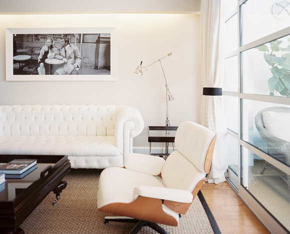
The Resurgence of the Chesterfield

Hi again . . .

I say "resurgence," though the Chesterfield style sofa has been around forever, you may just have only seen or thought of them in those manly offices out there.

Modern to industrial to traditional, the Chesterfield sofa is back, and I love it.  The richly detailed diamond tufted upholstery and rolled arms are it's most distinguishing features.  Many credit the Earl of Chesterfield who commission a cabinet maker to design an elegant yet masculine piece and it became a sought after style for most of the early 19th century, becoming symbolic to British aristocracy and wealth.

I have long loved the iconic style and my desire for one came about when I paid a visit to the show room of The Rug Company in Manhattan earlier this year.  Here's were it all started for me . . . can you say yum.... (now only to snag that peacock feather rug . . it's a beauty)


So as a Christmas present to myself . . it sits and is often fought over by all of us, deep enough for two nappers and quite the focal point.


Take a look at all the other rooms I have saved on my Pinterest boards to draw inspiration from and take a good look at how a Chesterfield doesn't have to be office boring !!


Think about it, or just give me a call, be happy to find the perfect fabric and order you one too.


12.24.2012

Install of the Day!

Hey . . .

I am loving having the day off.  It is so quite around here I am in heaven !!!  I am sitting in my new family room watching the cookie baking take place and we are finally getting around to decorating the tree that just made it in the house . . yes it's true.  I have been slammed, but worse, sinus infected which has put me in the "we'll do it later" mode, but realizing I only have 1 day.. thought it was time to get it together !

So while I have the day to sit and look around me new room, I thought I would share.  Did I need to re-decorate, not really, did I want to .. yep.  Why you ask?  I have wanted a chesterfield sofa for a while now and knowing BH&G was coming over to check out the place prompted the re-do.  I really wanted all the rooms to jive and feel like they do now!  

Take a look at the finished product . . 

So, it's quite the eclectic mix.  I love that.  Casual, easy leather, but a fun color.  A rustic "cart" coffee table found at the flea, another little beat-up leather chair and a great grouping of art.
 I popped the green with hot pink (pulled from the living room) all atop a flat weave grey striped rug.
I found these great lamps at Slate, love the mid-century element and great tie back to the floor lamp.  Check out the texture on one of my art pieces (Keith used tar in this piece).

 And I am more than thrilled to have my own Miranda Lakes piece, complements of Hidell Brooks Gallery.  I have wanted this piece forever !
 And there you have it.  My lavender grass cloth pained over in pale grey, my bookcase painted over in the same and re-arranged.  Two simple, dog and kid friendly pieces of furniture - not cluttered up, and a great collage of art.  That's all you need !

I love it !

All furniture and most accessories available at www.lucyandcompany.com


12.23.2012

Install of the Day!

Hi guys. . .

I wrapped up my last install before Christmas yesterday and wanted to show it off, it was truly one of my favorites, because it was such a challenge and the final product was just as I imagined.  It went off without a hitch, which at Christmas time I pray for !!

So here's the situation . . client - Maureen Baudhuin and her 16 year old daughter Kimmy.  The challenge - style and storage.  We have one 12 x 12 foot room, with 1 window, a small closet and an abundance of makeup, clothes, and shoes. These pictures will sum it up.


At my first meeting with Maureen and Kimmy, we agreed on the fabrics I wanted to use.  The look I was going for was a bit Parisian, a bit Bergdof Goodman, a bit Audrey Hepburn and a dash of Vogue.  I played around with a lot of ideas but this was the winner.  A wall of shelves and drawers with a new queen bed incorporated in the center.  This unit was to have doors to hide it all and a beautiful pop of color by designer Christian LaCroix in the form of a soft London shade.  Opposite the window wall, I suggested a new desk/makeup table with two very tall shelves on either side with doors as well.  These pieces would be shallow to house all the make up and shoes . . As far as art, my original thought was a collection of shoes I wanted to have Keith sketch . . but that developed into more personal pieces that Mekenzie helped me with!

Take a look at the boards.


Ok . . I kind of love when the finish product and the boards are exactly as I imagine !!  Kimmy now has an amazing focal point when you enter the room.  A 12 foot wide x 14 foot tall storage unit that incorporates a cornice, valance and new queen upholstered bed.  I chose the black and white for a clean bit of drama which also called attention to the amazing Christian LaCroix window fabric.  I love the splash of color!


A new queen bed, yay !  The headboard is actually stitched in the classic Chanel "quilted" pattern with buttons.  The pillows have that french feel without screaming it.  The knobs on all these pieces are actually curtain tiebacks that I gold leafed the night before !  If you need a bigger knob, try that.


all above photo's by Mekenzie France
Enter the artwork !!  My original thought was to have Keith sketch shoes for me, but I changed my mind.  With the re-do of my showroom and inviting Mekenzie's photography studio in, we are now loving the idea of incorporating something really personal in our spaces, especially our kid's spaces.  In this case we had Kimmy come in for a photo shoot.  These images were then incorporated in the space for a truly personal touch.  Take a closer look at Mekenzie's work.


Everyone got involved in this one . .  my thanks to Karen and Amy for the beautiful sewing job, Erin for her Chanel inspired headboard, Eddie and the boys for pulling off a really big paint job in 2 days and Shaun for his beautiful carpentry skills in creating all these pieces which are truly the jest of the room.  Great job everyone.

Need help with a storage-less room, want something really personal... give us a shout out!