1.05.2023

Install of the Day !

 Hi There !

One of my favorite rooms, why you say ?  The richness of it, the collected look and the feel above all else.  This project was fun and successful for one main reason, my client, Beth Langston and I worked together to achieve the end result !  We were on the same page working towards the overall vibe.  Dark,  moody, cozy.  What once was just a big white passage way to the upstairs,  is now a room to entertain, read, listen to music or just hang out and chat.

What I have been doing over the past couple of years or so is creating these saturated, collected, personal rooms.  Moving away from the large, all white.  I love older homes and I love smaller individual rooms. It may come from my love of British (old) chic.  We have project over there in motion and every time I go I fall in love with what I am seeing (it's definitely the vibe want for our new offices) When I have a client that shares the same love it makes it more than fun to work on.  We surprised each other with art, rugs and random furniture finds (via text images while we were on the hunt) and when the day came to bring it all in I was thrilled.  The final product was just how I pictured in my head, even better.

I am seeing now, splattered all over instagram are the trends for this New Year.  Color and saturation are replacing the monochromatic whites and beiges.  Now don't get me wrong - I can absolutely do the all whites so long as it's loaded with textures, but I am loving the return of richer colors.  I have always loved the layered collecting, been doing that for years in both my "city" house in Charlotte and for sure in my "weekend" place in the mountains (see here).  The art of the hunt is what I love more than anything.  There's nothing cookie-cutter about this, it's personal and special.

Take a look !


The key was the perfect "merlot" color for the walls mixed with a deep teal grasscloth wall paper in the niche.  LOVE.  That color was pulled from the amazing Kelly Wearstler curtain fabric, not a match, but deliberately close.

Curtains and walls done, then onto the furniture.  Carmel leather mixed with a plume velvet vintage chair, along with a random hide chair and ottoman.  I try to keep in mind the legs on things, mixing up the look so there is not too much "fabric" and each piece is different than the other.  Beth found the art over the sofa.  We loved that old man, framed in a heavy brassy frame.  Layering the rugs was another must on my my list.  The room was so large and oddly shaped the solution was a large seagrass, perfectly cut and bound on site, layered with a vintage Moroccan over top.


Across from the sitting area we created a game table spot.  Now I have been dying to use these leather and wood chairs, but no one would bit.  I knew Beth would .. was thrilled.  I love them so much and they are perfect.  She then found the large wall mount, over table wall fixture which just the right look and size.  


Let's talk about the art... two amazing pieces by J. Louis, through Shain Gallery (here).  Now I brought them over mainly show Beth the best sizes and basically because I loved them so very much !  She did as well.  We added them to the wish list, but look how the colors are so beautiful and the composition is just perfect.


On a side note, I love his new work.. take a look !  Just amazing and all available through Shain Gallery here in Charlotte.


all images from Shain's website


The colors continued up the stairs with the mix of a black railing.  We kept the leopard runner, because, well it was perfect !  As a place holder for now we pulled a side chair into this spot until the perfect turntable cabinet is found !!!!!


A few details - this large floor lamp, the perfect navy velvet pillows, all a perfect tie in to those killer curtains.


Lastly, layering in my client's existing are with two new large lamps all atop her existing sideboard !

VOILA .. one happy room.


Now... wanted to include the dining room we completed a while back.  I feel it's different yet visually cohesive with what's now happening in the lounge across the hall !

For you people that have a "formal" dining room that you only use on holidays I say... "it's probably beautiful to walk past and look at, but why not really use the space !"  If you are about to design your dining room keep in mind to think about more regular use and choose your pieces accordingly !

A very visible space as you walk past constantly towards the kitchen and family room we wanted a little drama.  While working with Beth room by room in her home, this dining room was a space we both were really excited about just as much as the lounge.

First off.. a killer paper.  This grasscloth, by Windy O'Connor was where we started.  It jived with the rest of the house but created such visual impact when you we in and walking past the space.


We then started mixing in all the pieces.  Texture, uniqueness yet simple.  A huge vintage round mirror, cain back chairs, beaded chandelier and wood curved back side chairs.


A very casual rug and contrasting painted ceiling finished off the look.  I love this dining room !

photos by Mekenzie loli

This home is well on it's way.  I am meeting Beth this morning to go over the front foyer and master bedroom.  An ongoing relationship which I love.

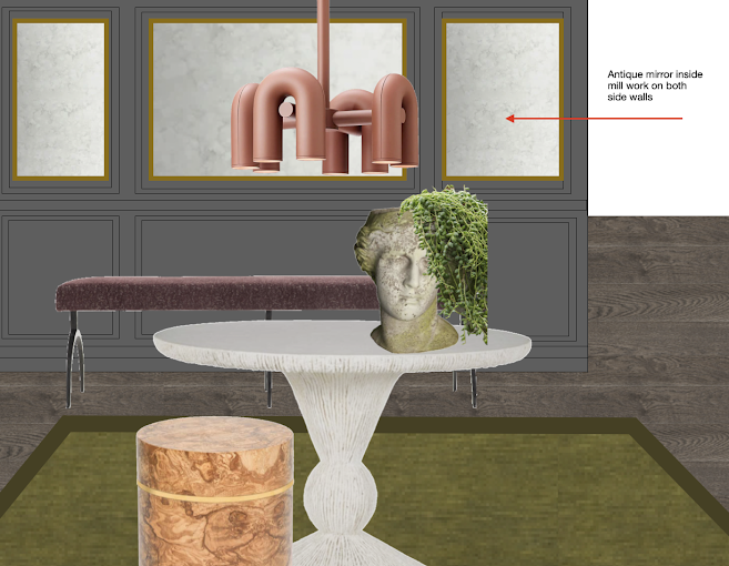
Take a peek at what I am proposing for the foyer... pulling together the colors from both the lounge and dining room !


Finger's crossed.