12.28.2014

Transformed Home Office & Guest Space, Plan No. 2

Hi There !

Plan No. 2 for the room Holly texted me was "gross."  Her home office & guest space.  I can't wait to get my hands on this one.  Over the garage, Holly retreats up there to work and get away - just too bad it's not a space that inspires.  More like a home of mis-fit and rejected furniture, a somewhat guest space and her desk.  I don't know about you, but I can't work in a space that's not pretty, cozy and inviting.  She put her main living spaces high on the list this past year, her own master and office had to wait. But I think it's time !

Here's my layout . . . for this long, narrow space with a small window bump out.


So I started here - a custom laser cut divider and a rug.


The divider is the first thing I wanted to do, right off the bat.  I had to separate the areas, yet didn't want to add a full wall, I wanted the light to come through.  I love the idea of having it made, laser cut and mounted to the wall and ceiling.  Behind this screen, I want to move the bed to the side wall as oppose to under the single, back window where it is now.  The rest of the sleeping area has a rug to anchor it, a storage piece Holly currently has, a side chair, floor lamp, blinds and great art.  It's cozy and pulled together.  The wall color, gray with a purple cast - pulled from the rug - and just a yummy color that still relates to the rest of her home, yet different.


On the Ben Moore fan deck, we have several good ones . . . I would get the rug in first to pic one, but thinking Ben Moore 2118-50, or maybe a little warmer.


The sleep area has a new upholstered headboard with nail head detail to attach to her existing frame.  New side table and lamp - pretty graphic rug.


Totally in love with this new lamp.


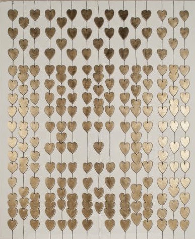
Gotta have some art of course.  We have more room to the left of the back window.  This piece by Natural Curiosities has these gold leaf heats in a pattern.  Simple, yet strong.  To the right of the window I want to place a cream leather occasional chair and floor lamp to balance the art.


The center of this entire space is designated as a work zone, sitting space and another "game" table which can double as additional work space to spread out.  The rug I chose to define this center space is where I am pulling all my colors from.  Creams, dark browns, lavender and a small dose of the teal blue I used as a major accent color downstairs.  Thick, warm and worn in looks.  I love it.


Along with the gray - lavender walls in the overall space, I want to mix this wall paper in the nook for added interest and warmth.


The teal blue makes a come back up in this space in just a few pillows.  


In the nook window fabric.  I especially loved the layered look of the wall paper and curtain fabric.  The punch of the upholstered teal game table she already has - finally has a home !!!


I can add to large burlap covered push pin boards for work (or just fun pics).  Burlap, with it's texture and rawness works beautifully with the age of the rug.  The overhead fixture also shows a little age with the antique mirror.


In the center of the room - a pair of gray leather chairs.  Very comfortable and easy to care for.  A cozy place to sit (with TV on the nearby wall), binge watch, or meet with co-workers.  


A little more in the way of cool lighting.  Right as you enter the room at the top of the stair.  With a console underneath.

I love all the patterns and textures in this space !!


Take a closer look of the white cabinet below.  Must be one of the prettiest "file" cabinets I have every seen !!


Can't wait . . . I would never leave this room.


Finishing Off That Master Bedroom, Plan No. 1

Hi There . . .

It wasn't too long ago my client, Holly,  sent me a text, something to the effect, her home office (& guest room) and master bedroom were "gross."  I love her.  She has the craziest life - full of kids and work travel. She doesn't have a tone of time, but she does have an opinion.  She knows what she likes.  With her main floor designed and installed last year during the family's spring break (check it out here), I was lucky that she loved it all.  Over this Christmas break I am messing around with her Master Bedroom and Home Office designs.  That may sound horrible.. working over a family break, but I am one of those early, early risers and get the most creative when it's quite in the house.  Over several mornings, I read my favorite blogs, pulled ideas and worked on these spaces for Holly.  I created all these design boards in the hopes to give her the best visual I could.

Take a look at the colors I am going for (cause it jives with the first floor and she already has a rug to work with with blues in it) . . .


Starting off - the space has one problem (to me) that has bugged me    f o r e v e r.     The windows. They are short with a ton of wall distance over then to the ceiling.  The room itself is huge. These short windows have blinds on them which is fine, but in a room this big with such tall ceilings it's a shame not to make that a statement.  My solution?  Bring a pole and non-functional panels to the ceiling.  The make "faux" flat, but pleated, roman shades that hang just under the pole on the wall and dip into the short window over the bamboo blinds, essentially covering all that wall and creating the illusion of very tall windows.  The blinds will function as they do, but surrounding them with tall panels and roman shades that will create  the drama this room so needs.   Take a look here.  Her side tables and lamps are great - we can keep those. . 


I chose a light, airy overlay fabric in a graphic pattern - light color.  This fabric has a structured and layered effect, three dimensional.  Available in four colors, I am choosing the light "steel."


Paired with those amazing, tall statement windows, grass cloth in the entire room.  It may seem too  "tone of tone" and lack color - but the texture is what I am going for.  This grass cloth will also help these huge walls.  We have two other whole walls with no windows,  so it needs it.  That,  and art ! Master Bedrooms, in my opinion,  should be calming, generally, but this large space needs texture and pattern to keep it from feeling so huge and sparse.  


Her existing rug is great.  Love it, and it does drive the colors a bit.  What I don't love is the size.  Too small for this big room.  Even though it's an 8 x 11, still looks to small.  I want to add a huge textured sea grass under it and layer this on top.  


Tall ceilings need big lighting.  This Oly glass fixture is not only romantic and dreamy, it's a show stopper.  What I am suggesting though is a little something extra, and different in the way of lighting to mix with it.


I love this fixture.  It's unique for sure.  I ordered one for my office (the smaller one) and hung it in a corner - it's a conversation, and adds just the most beautiful down light.  Holly has a grey chaise in the space I want to keep.  Plan is to add this fixture as well as the center chandelier.  Off setting it by the chaise - gives you reading light and a gorgeous visual from the other side of the room - the bed side.


The second biggest problem I see in this space is simply the ample amount of wall space... now that may sound crazy, a huge bedroom would be so fab, but it can be daunting to decorate.  How do you make it cozy without having a ton of stuff in the room?  My advise is to make everything "exaggerated," hence the big windows.  A big custom bookcase is another way.  There is a huge wall opposite the bed with a nice TV storage cabinet on it.  The TV actually raises up out of the piece, cool.  But, and sorry Holly, I would sell it and do something different on this big wall.   A huge bookcase / dresser combo that is dramatically high with hidden inside lighting and very modern with a lacquer finish.


Now I got the style and idea from another vendor of mine, Modern History, but I want to make it much bigger, taller and incorporate drawers.  Similar in color and I love the gold edge detail, but raising it up and modifying a bit could fill that huge wall.  I do want to keep it open on the back to see that grass cloth and add hidden lights to highlight large black and white photos and simple accessories inside.  YUM !!!  Again, another focal point from the other side of the room.  This side of this large space with "glow" and have great presence, I think.


Holly's existing bed, side tables and side lamps - all good and all can stay, like I said - she has great taste,  just needs help pulling it all together for a fully "designed," finished look.  So here ya go Holly.  Can't wait to get my hands on those windows !!!


Stay tuned for what I have planned for the Home Office and Guest Space !!


12.24.2014

Spotlight Jeffrey Alan Marks

Hi There . . .

I met Jeffrey Alan Marks in Atlanta last year, briefly of course, but felt he was quit approachable and frankly just down to earth and easy to talk to.  He admits, in his new book, to be somewhat quite and reserved, which you probably wouldn't think if you have ever watched him on Bravo's Million Dollar Decorators.

His fresh and timeless design is what I am most impressed with.  He has the ability of mixing classic looks with an edgy feel which has earned him recognition as one of today's most influential designers, and listed in Elle Decor's A-List of top 25 decorators - that's huge !


I added his new book, The Meaning of Home, to my ever growing coffee table stack.  The one thing about this read - it will calm you and bring you back to the classic look that never dates.  Somewhat reminiscent of "As Good as it Gets"  - Hampton's beach house - Diane Keaton roamed in her white turtleneck, yet 2014.   That movie, a classic, and the feel of that home reminds me of Marks, but with a great surprise in every space !!


Is he infamous for the row boat above his bed?   Maybe.  But this is the unexpected element that makes his designs stand out and never boring.  Elle Decor is by far my favorite publication, it's confident - as is Marks.  Congrats for being included in the 25th Anniversary video clip narrated by Editor in Chief - Michael Boodro, sitting in that red chair along with the greats.


Take a look at some of his gorgeous work.


He has just launched a new line of fabrics with Kravet.  This designer collaboration, "is inspired by nature, the beach in particular."  In college he played water polo and the "water polo nets" pattern started it all, according to Marks.


Take a look at a few of my favorites, all in the blue color ways . . .


His idea of a modern floral.


He chose Kravet to work with because they "aren't corporate."  I agree 100%.  When I visited their NY offices I felt a sense of family, why ? - family run business.  Their main offices are not only beautiful, they are filled with amazing talent, a sense of ease and a spirit.  Ninety-Six years, five generations of one family!

Love your collection Jeffrey and congrats.